Malva Jewelry
E-commerce redesign for a growing retail network. Bringing the brand's craftsmanship and identity into the digital shopping experience — across desktop and mobile.
Malva is a Ukrainian jewelry manufacturer and retail brand with its own production and a network of stores across Ukraine. For more than 30 years the company has been creating timeless pieces that combine classic craftsmanship with modern design, offering both ready-made collections and custom jewelry tailored to a client's idea.
Redesign the e-commerce website to better reflect Malva's premium brand identity and improve the shopping experience across key flows — browsing, product selection, and checkout. The result needed to work seamlessly on desktop and mobile, and be structured in Figma in a way the team could maintain and extend going forward.
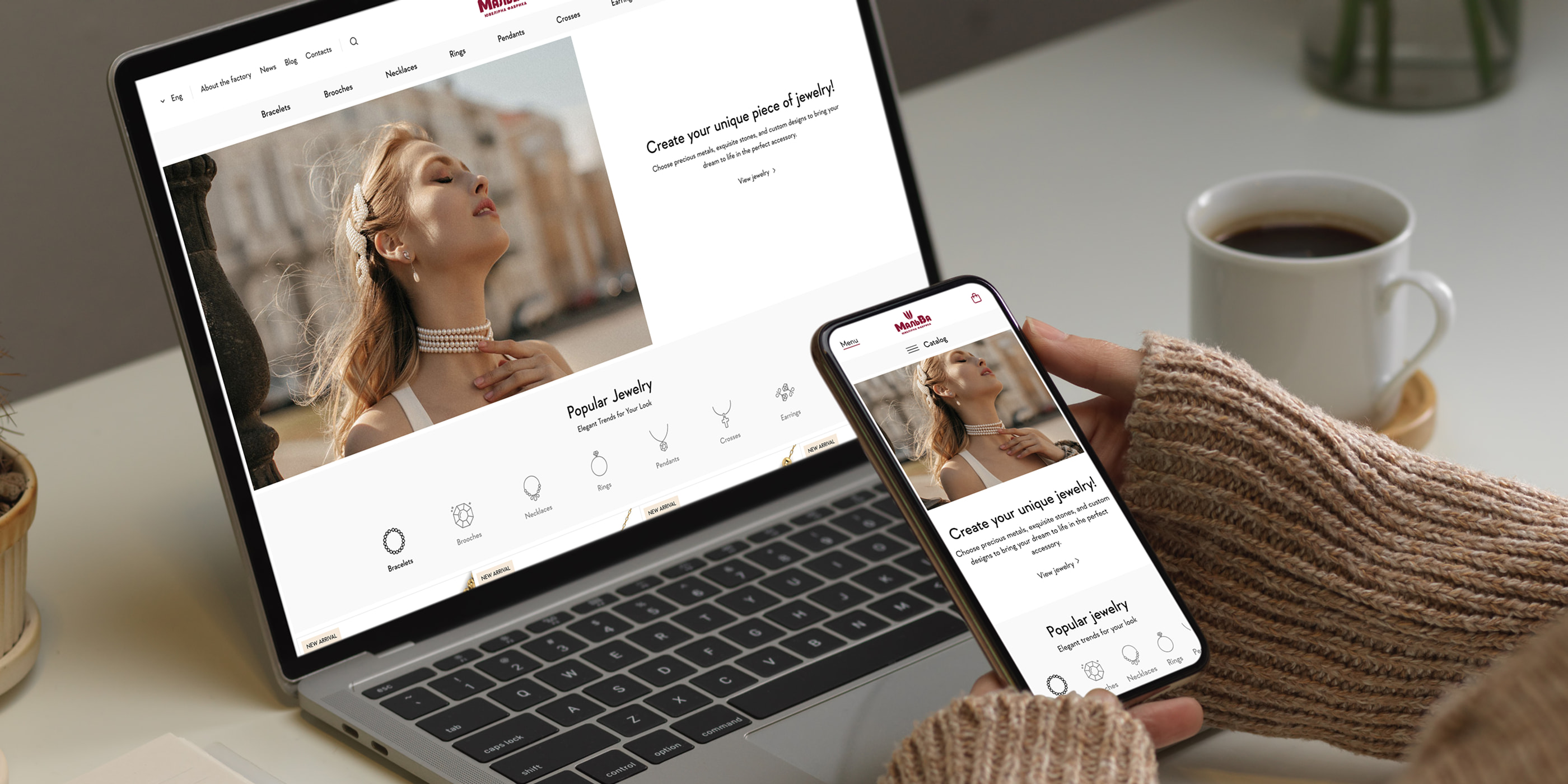
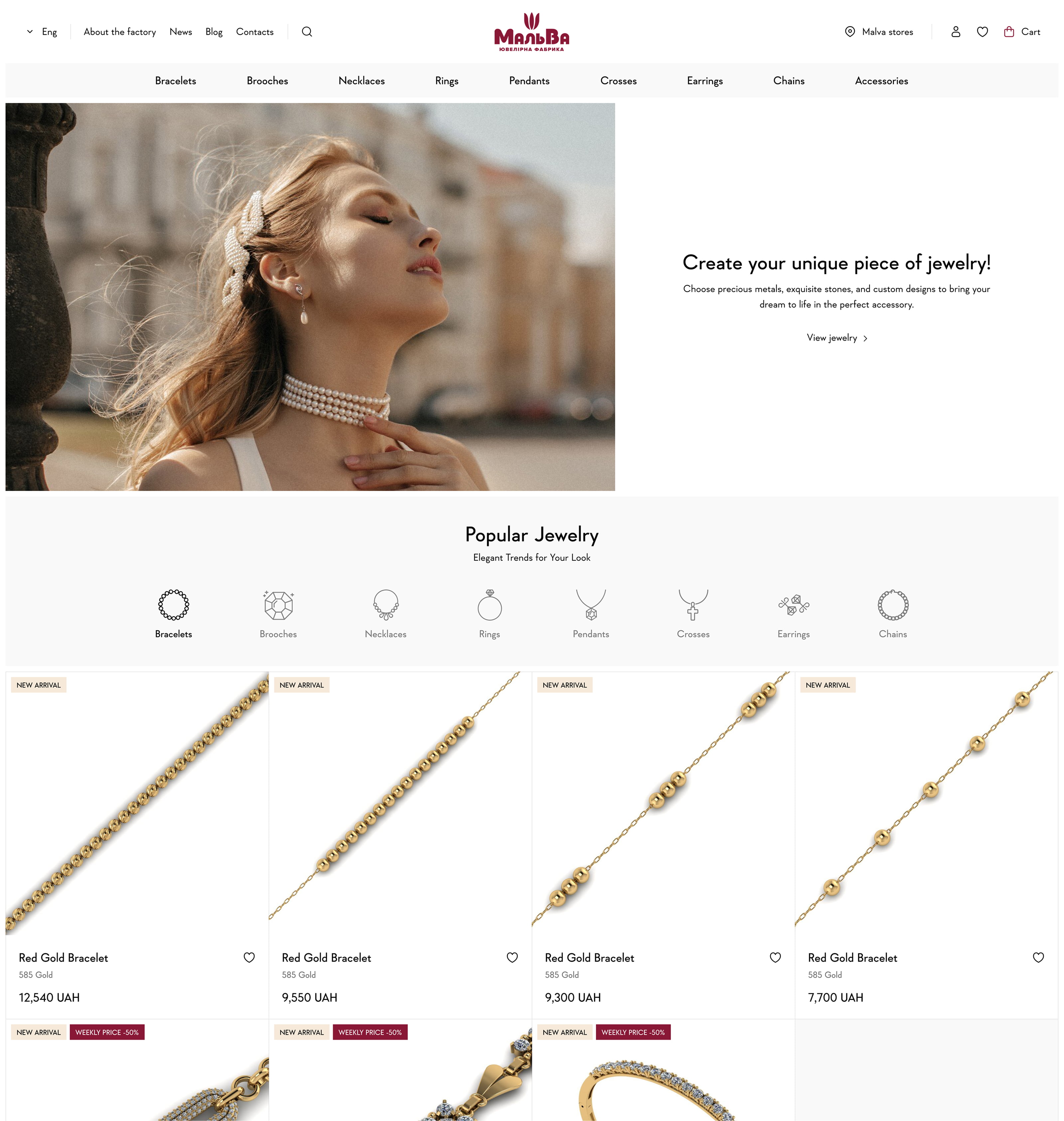
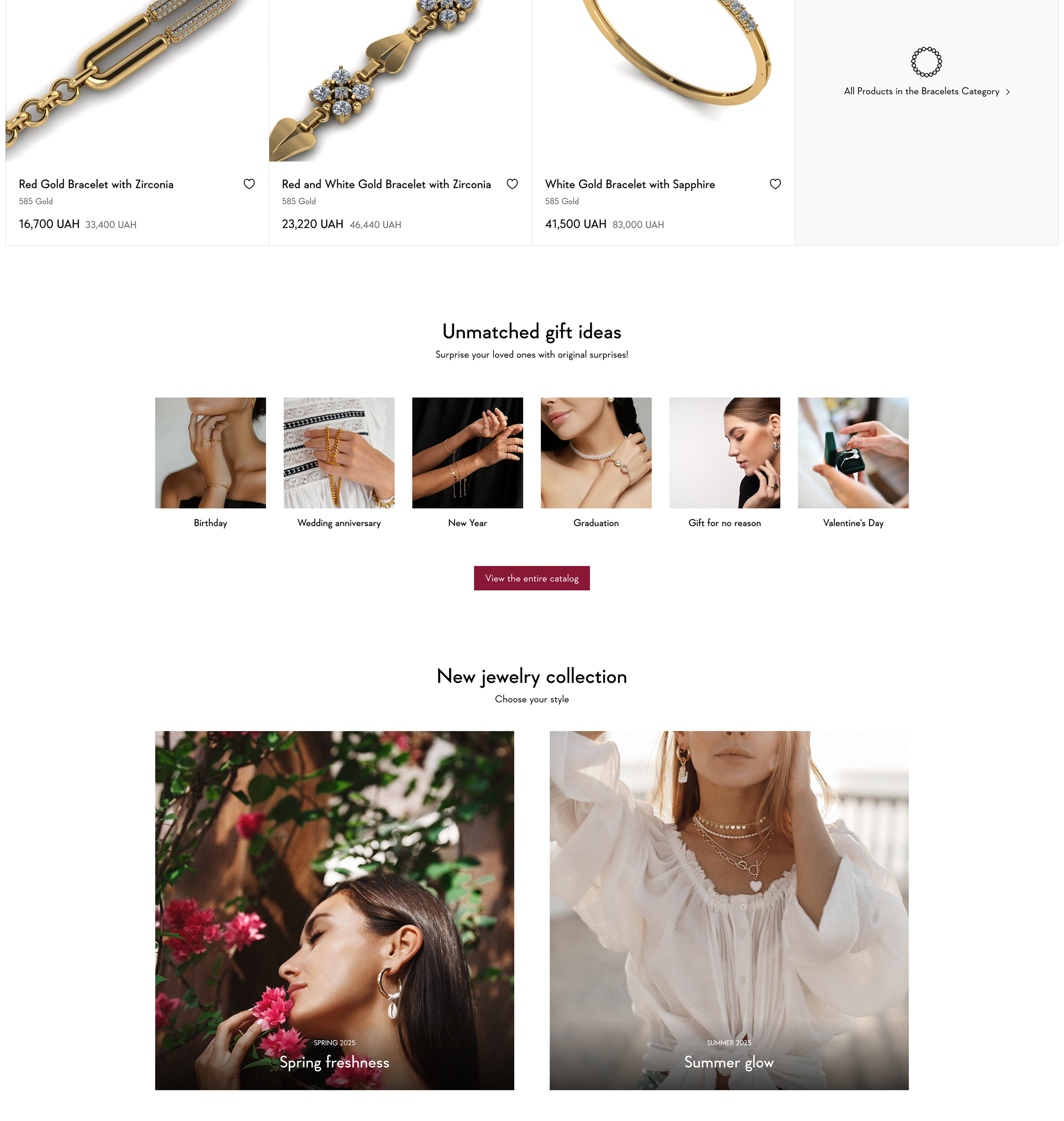
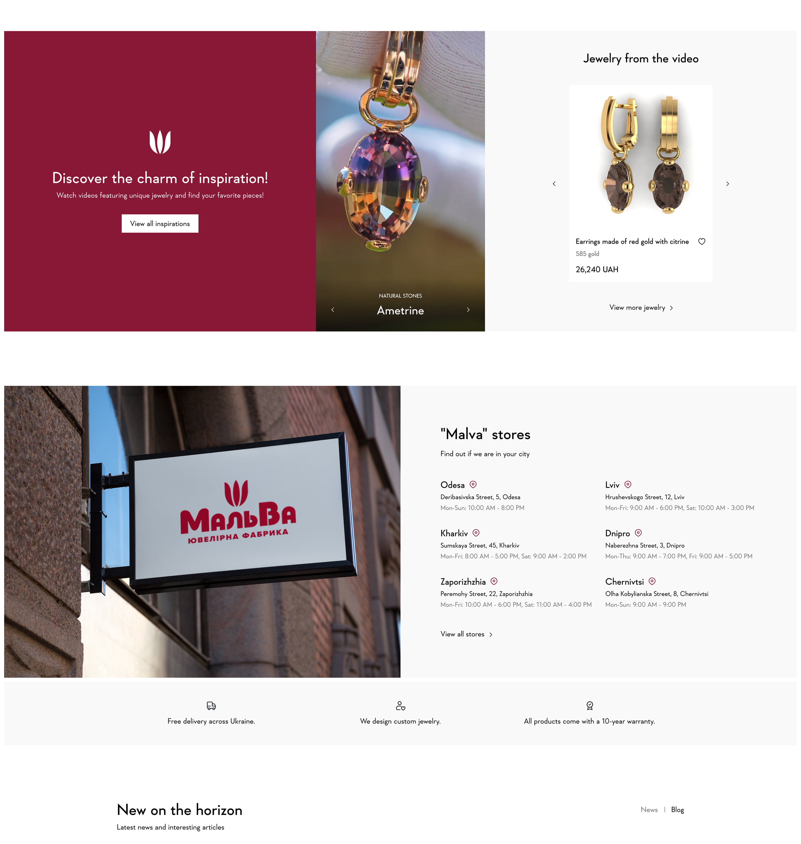
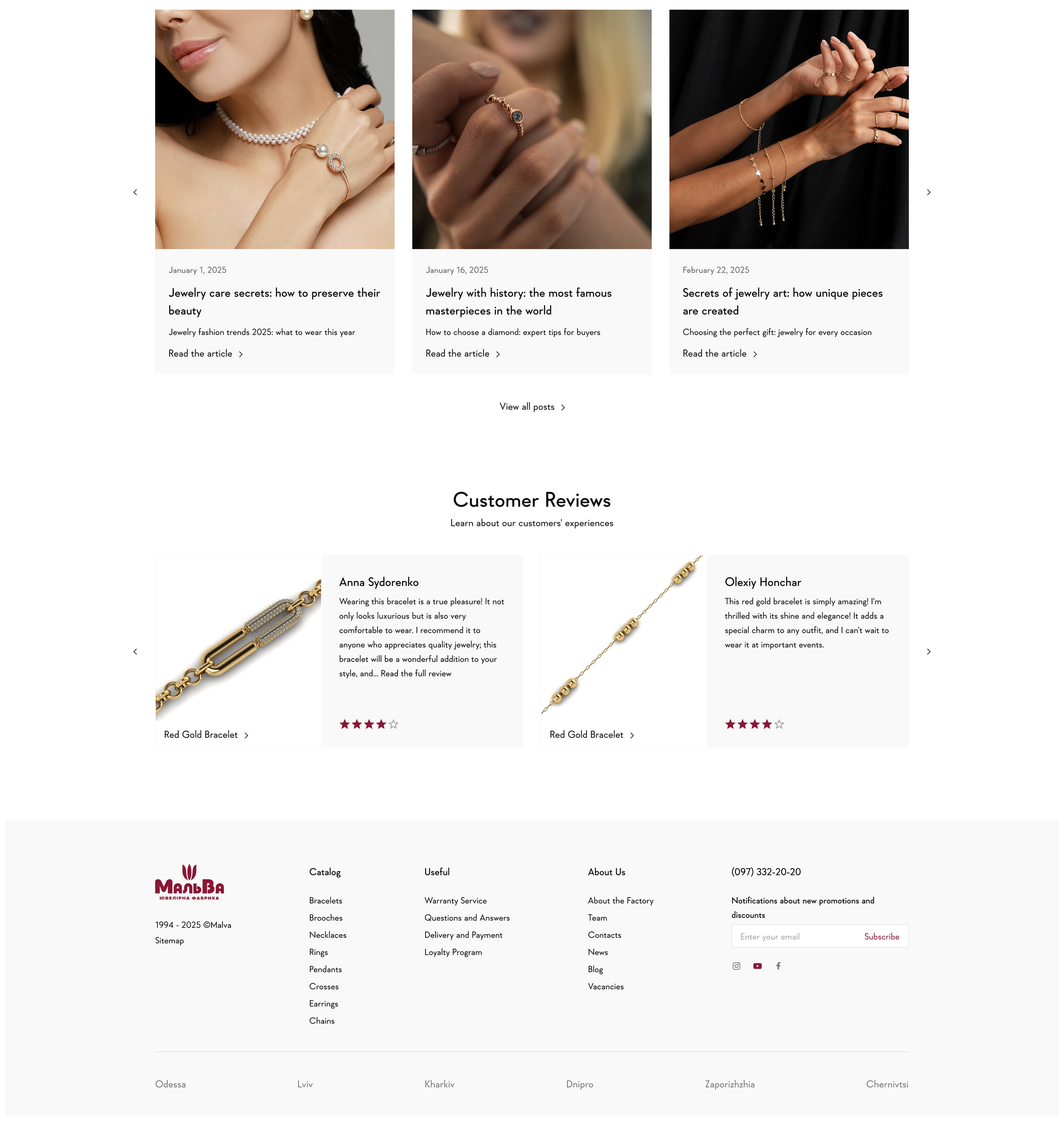
Homepage — Desktop
The homepage establishes the brand's visual identity at first glance. A structured layout with clear section hierarchy guides visitors from the hero through collections and featured products. Consistent spacing, refined typography, and curated imagery communicate the quality that Malva's physical stores carry — translated into a digital context.
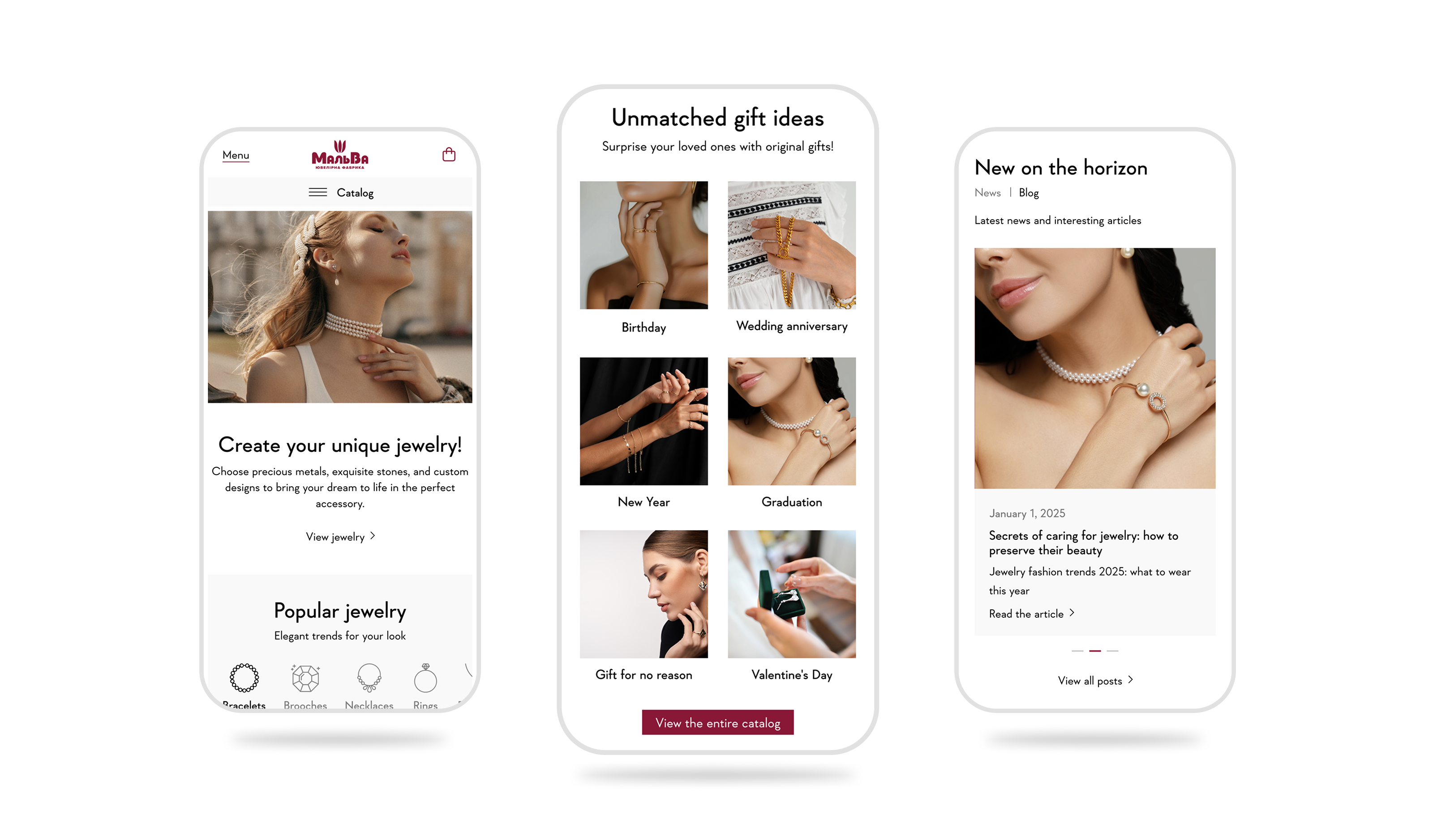
Homepage — Mobile
Mobile accounts for a significant share of jewelry browsing — the design had to hold up at smaller sizes without losing the brand's feel. The layout reflows gracefully: touch-friendly targets, a streamlined navigation, and image-forward sections that let the product speak without clutter.
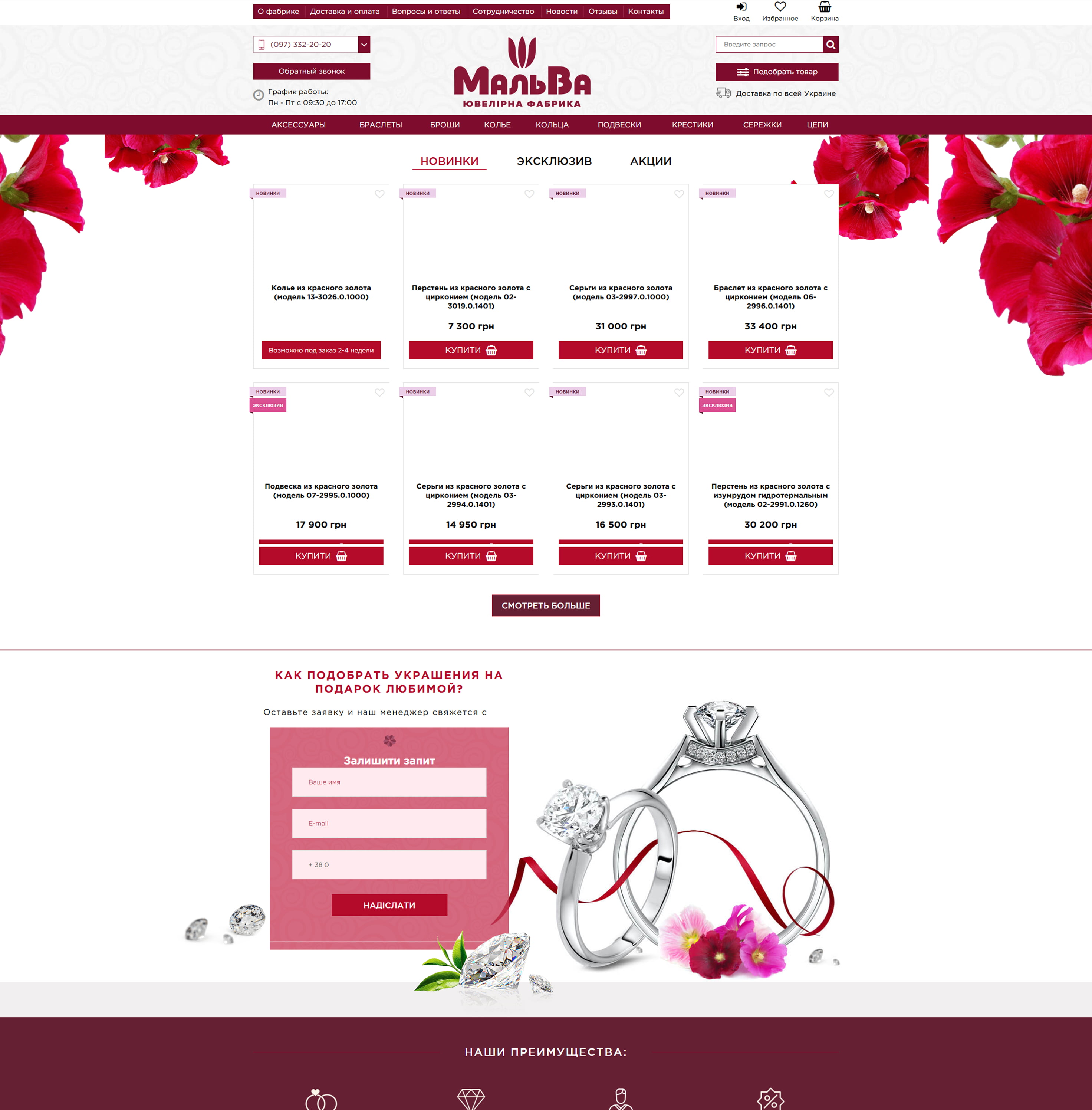
Previous Design
The original homepage had grown organically over time — sections with inconsistent spacing, mismatched type treatments, and imagery that didn't reflect the brand's current direction. The visual language didn't match the quality of the product. Understanding what wasn't working informed every decision in the redesign.
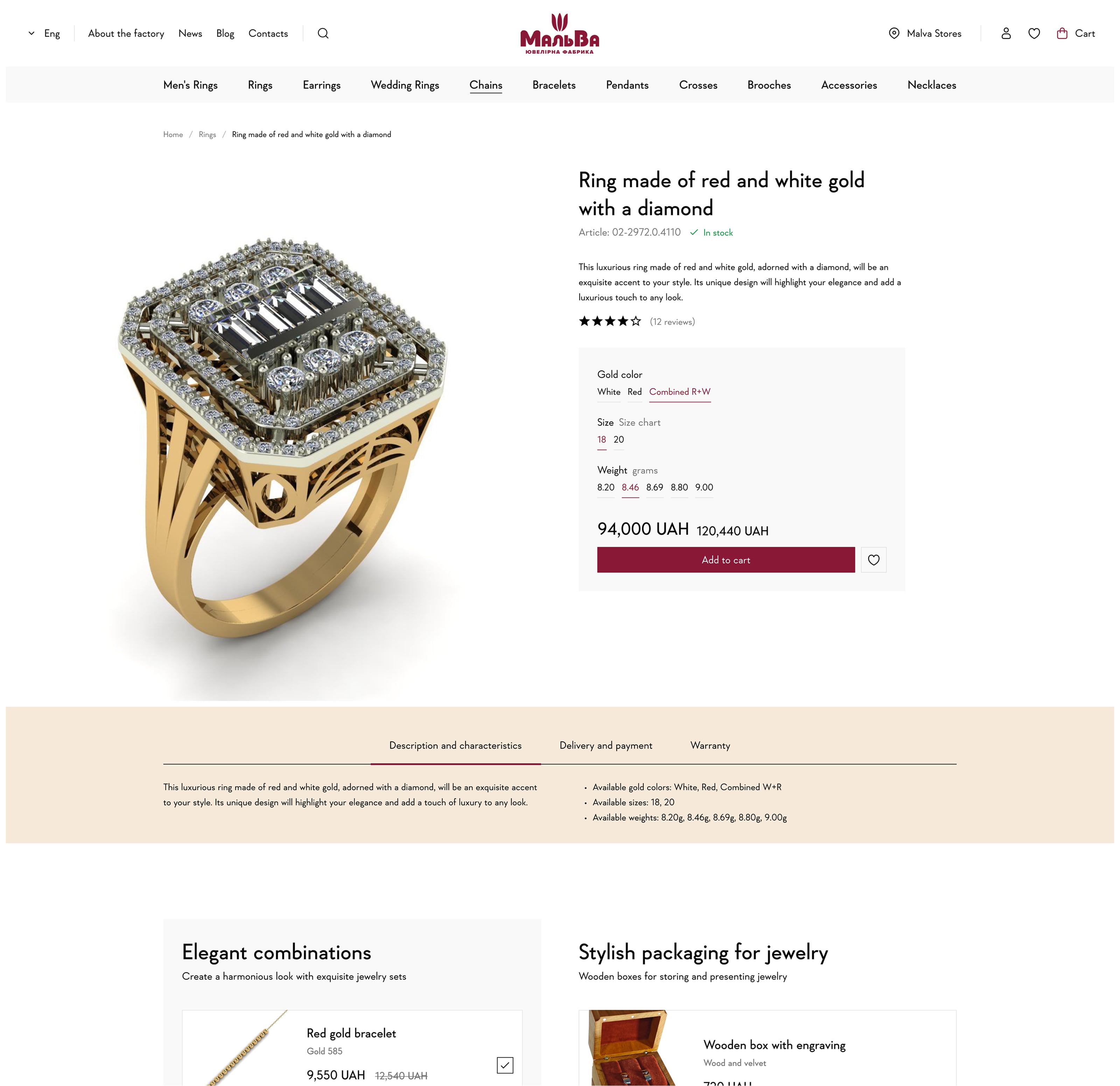
Product Page
The product card is where purchase decisions are made. Clear hierarchy between imagery, name, price, and key details — with variant selection and add-to-cart accessible without scrolling. The layout balances information density with breathing room, giving each piece the presentation it deserves.
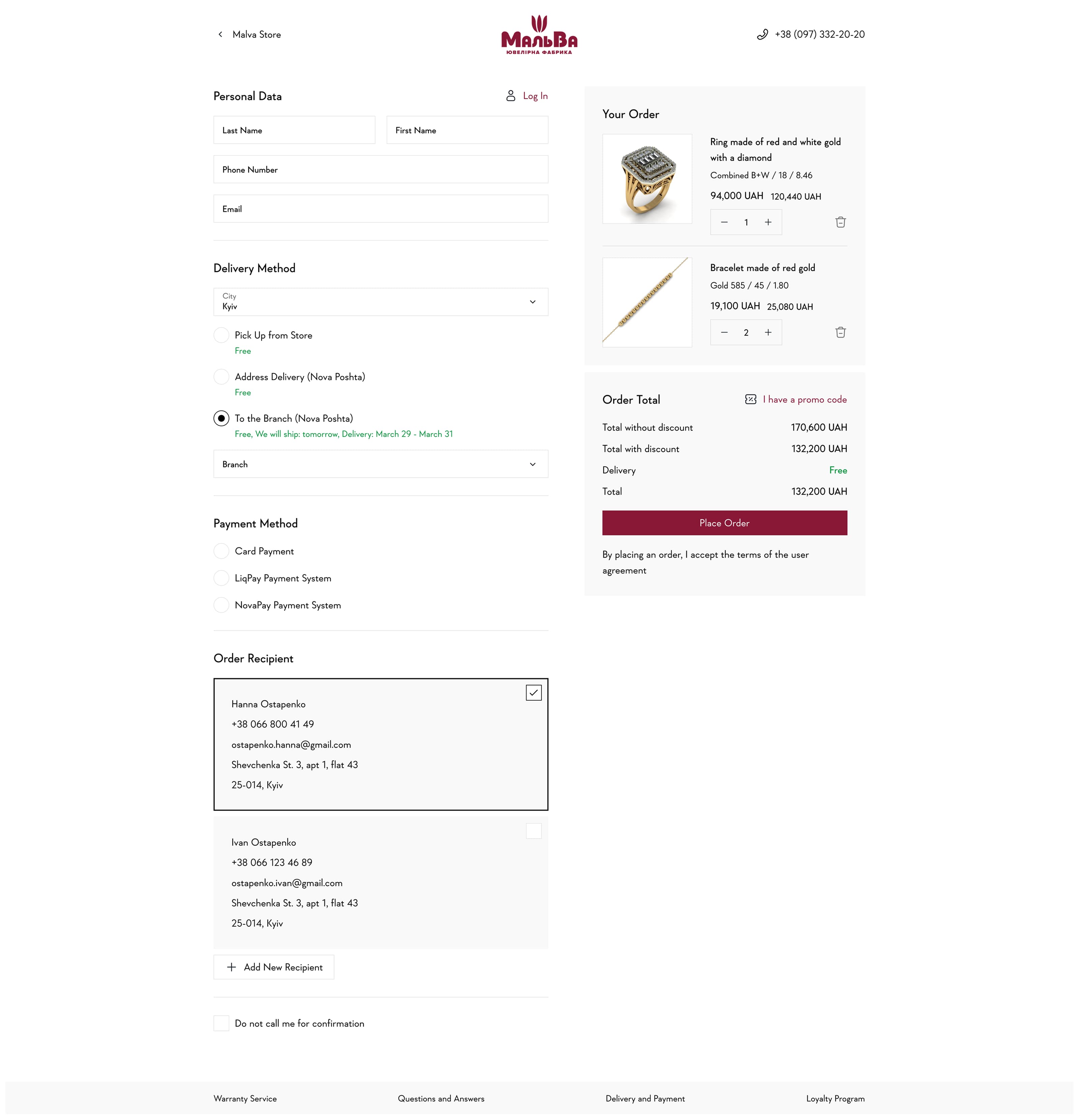
Checkout
Checkout is where friction costs the most. The redesigned flow reduces steps, surfaces order details alongside the form, and keeps the experience clean and focused. Form labels, field states, and error handling were all designed explicitly — no ambiguity about what's needed or what went wrong.
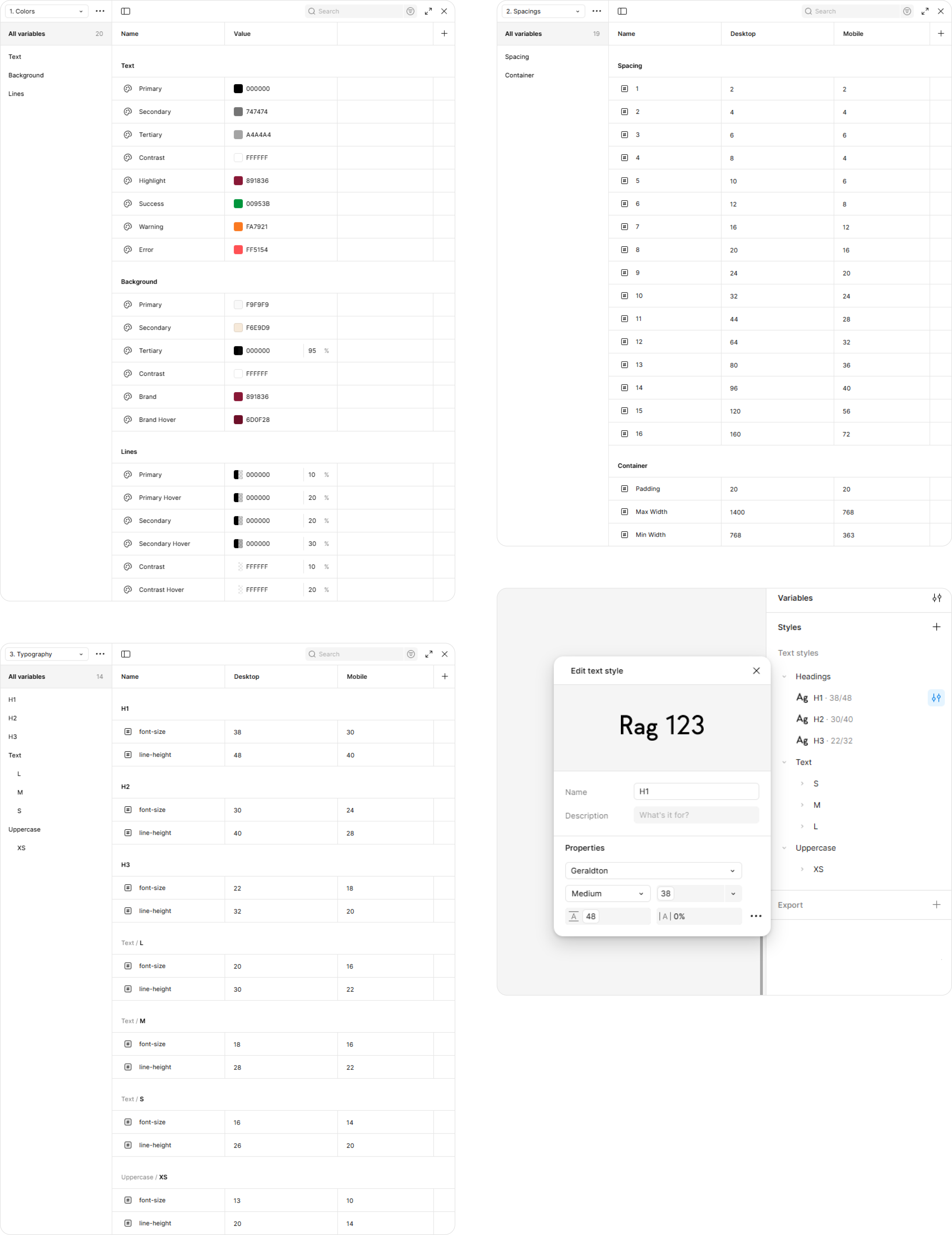
Figma File Structure
The Figma file was built for handoff and longevity — not just for the initial delivery. A clear component library, organized pages by screen and flow, and a consistent naming convention made the file navigable for developers and extensible for future work without unraveling the structure.
A redesigned e-commerce experience that matches the quality Malva has built over 30 years in physical retail. The site now reads as a premium brand — coherent from homepage to checkout, consistent across desktop and mobile, and structured in a Figma file the team can work with independently.
The product was always premium. The website needed to say the same thing.