GeekGroup
Website design with dark mode. Bringing structure and consistency to a fragmented visual system — and scaling it across light, dark, and mobile without rebuilding from scratch.
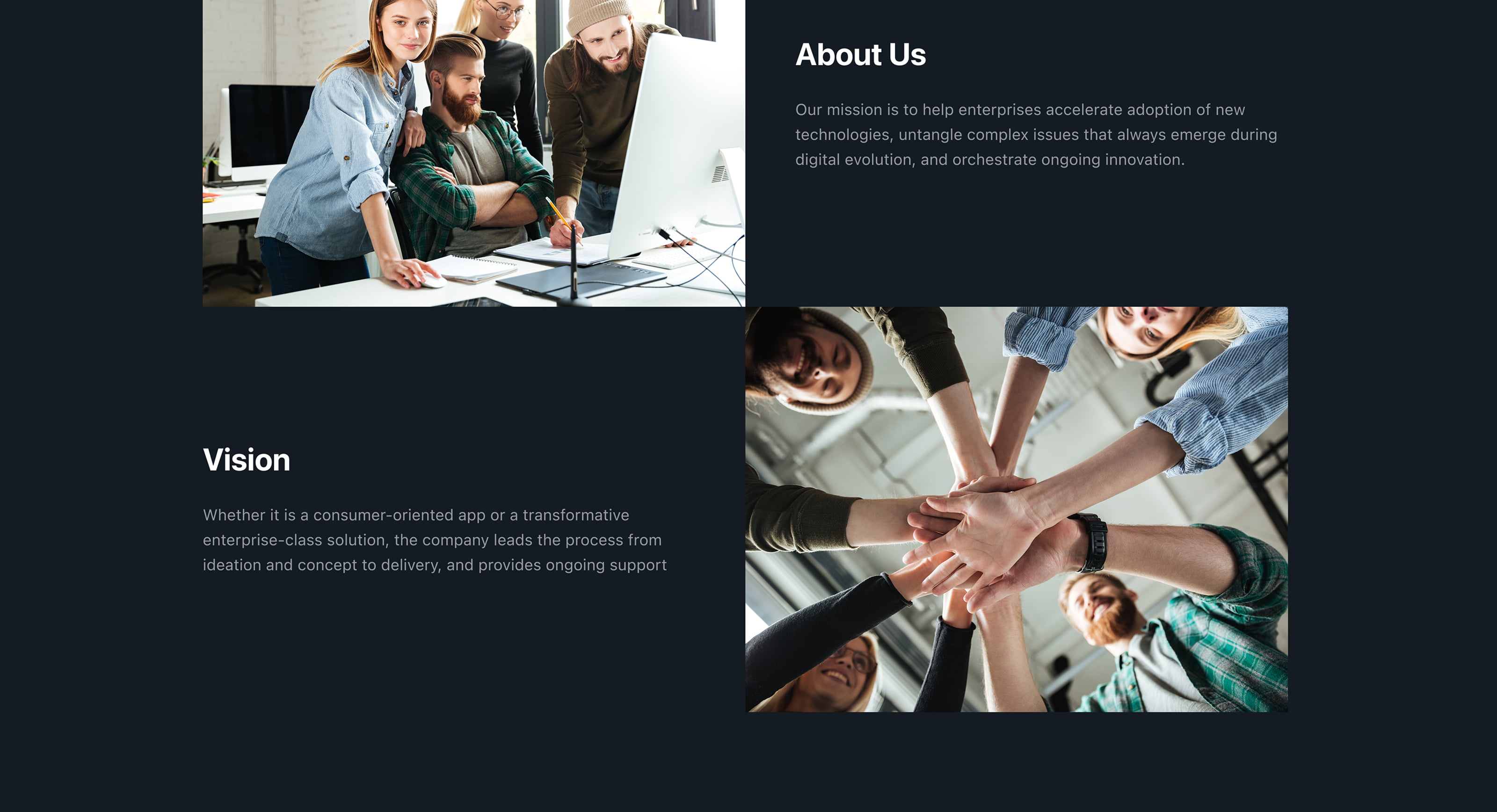
GeekGroup is a software development company that builds web and mobile products, enterprise solutions, and AI-powered systems for businesses. Their services span design, engineering, QA, deployment, and ongoing support — all under one roof.
The site existed, but had grown inconsistently over time. Different sections felt disconnected — varying spacing, mismatched type scales, and no shared visual logic tying them together.
Systematize the existing design without rebuilding it. Establish a consistent visual language across all pages, introduce a fully functional dark theme, and adapt layouts for mobile — all through a variable-based system in Figma that made switching and scaling require minimal manual work.
The constraint was to work with what was there — clean it up, align it, extend it — rather than starting over.
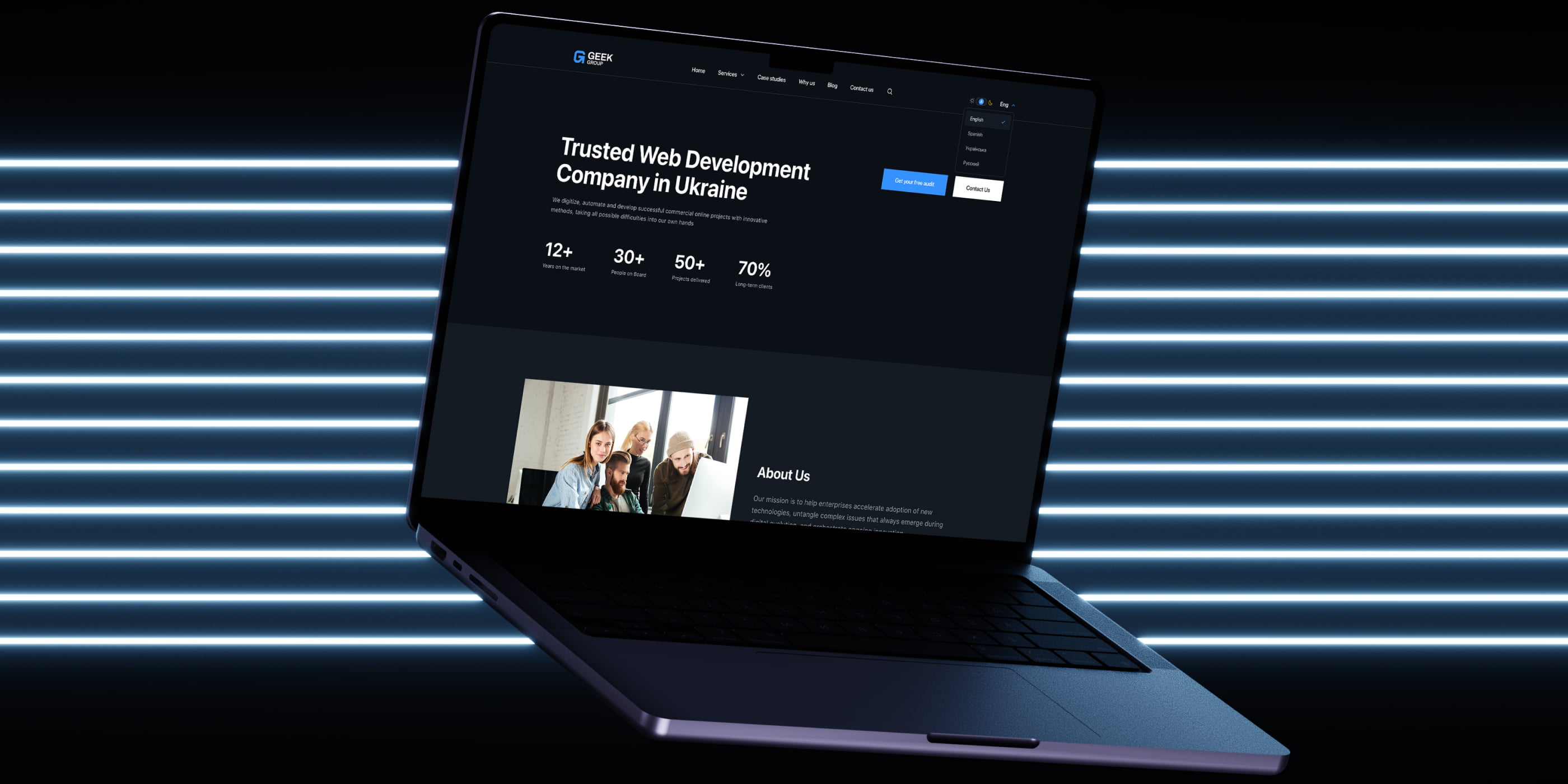
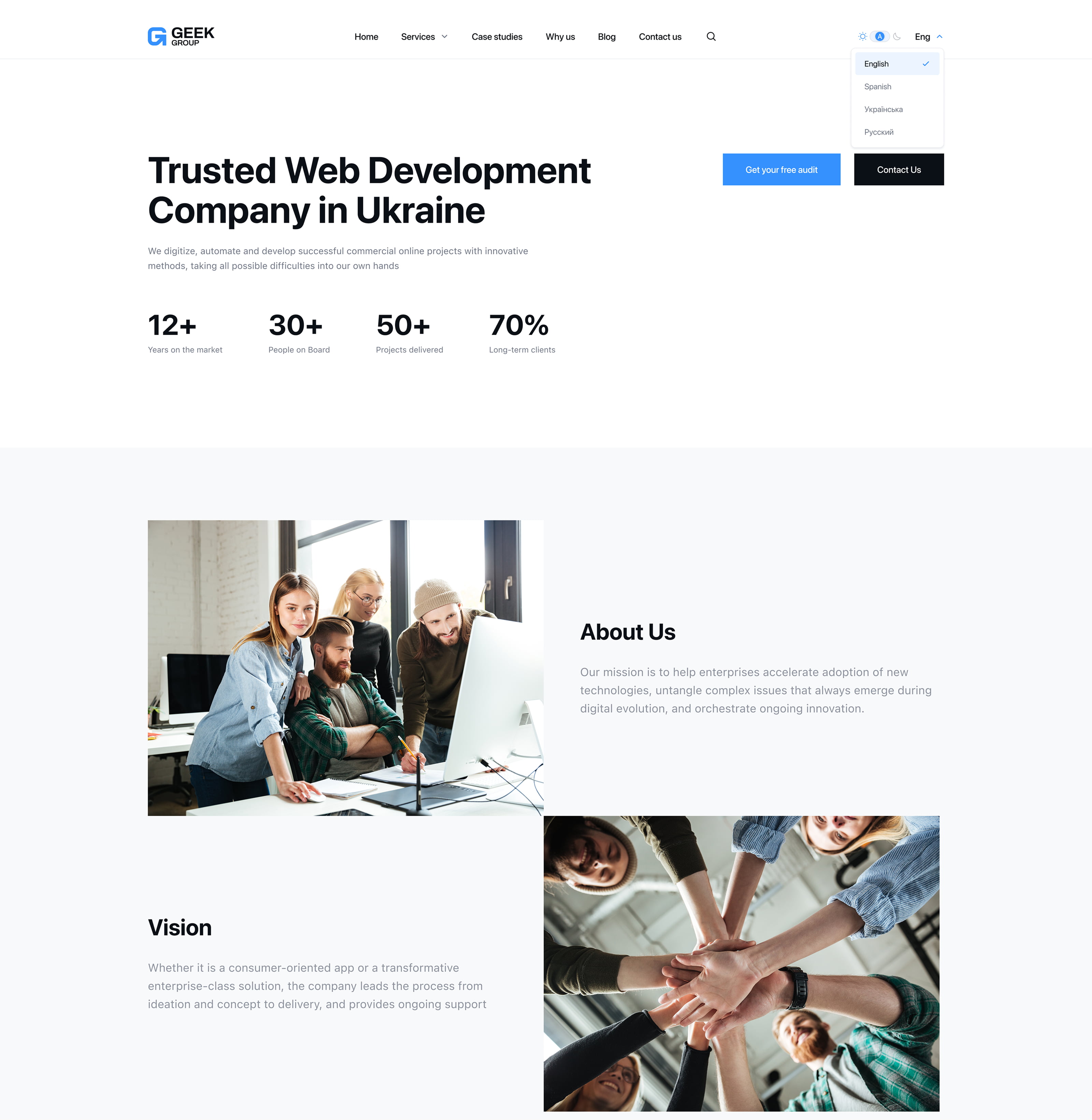
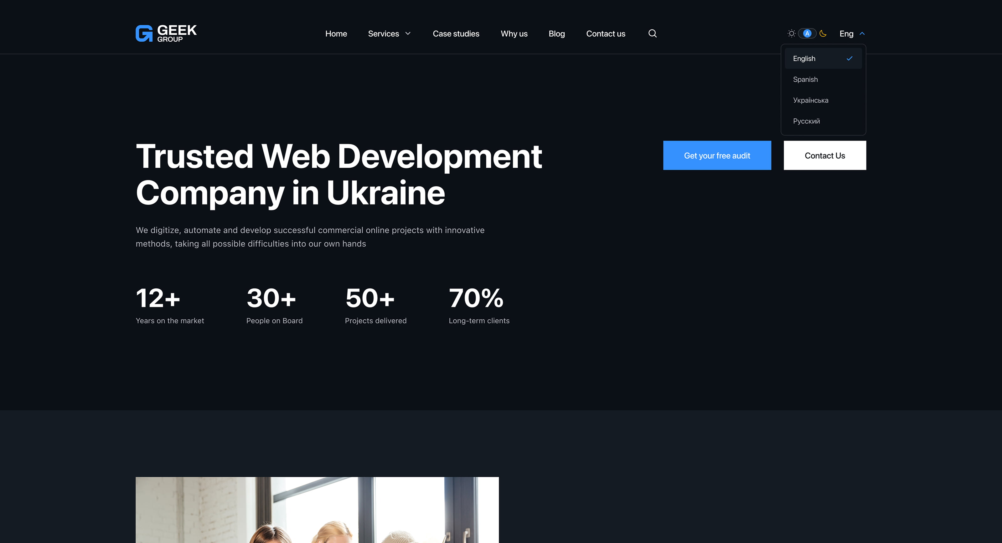
Homepage — Desktop / Light
The main entry point of the site, rebuilt from a fragmented layout into a structured, scroll-driven experience. Unified spacing, consistent section rhythms, and a clear typographic hierarchy replaced the patchwork of styles that had accumulated across the page over time.
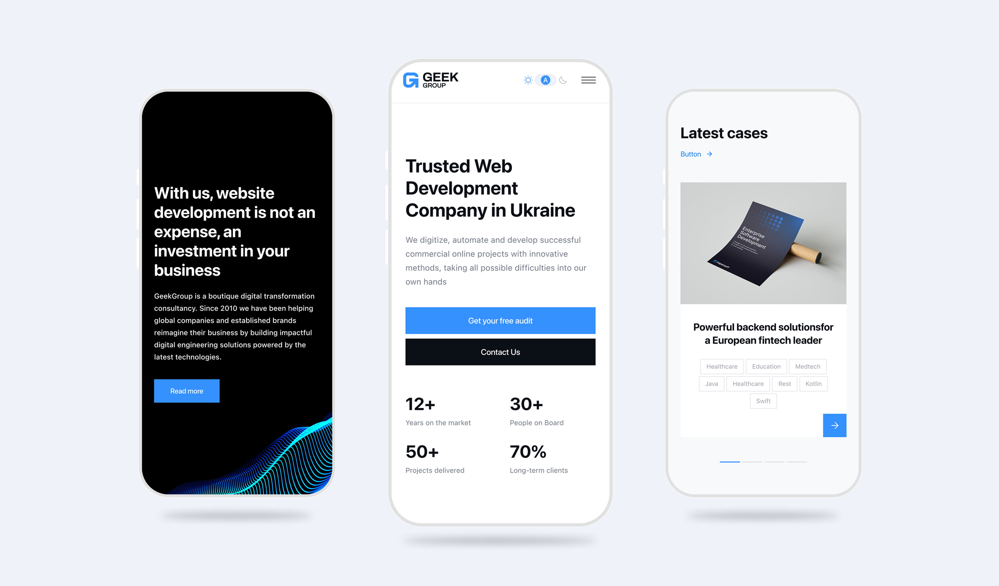
Homepage — Mobile
Mobile adaptation built through the same variable system — no parallel track of manual overrides. Layout reflows, type scales down, and touch targets expand, all driven by the design tokens established for desktop. The result is a mobile experience that reads as the same product, not a scaled-down afterthought.
Part of Dark Theme Homepage
Dark mode wasn't layered on at the end — it was built into the system from the start. Design variables handled the theme switch: backgrounds, text, borders, and surface colors all mapped to semantic tokens that flipped together. The dark theme required no per-component overrides and no redesign of the layout.
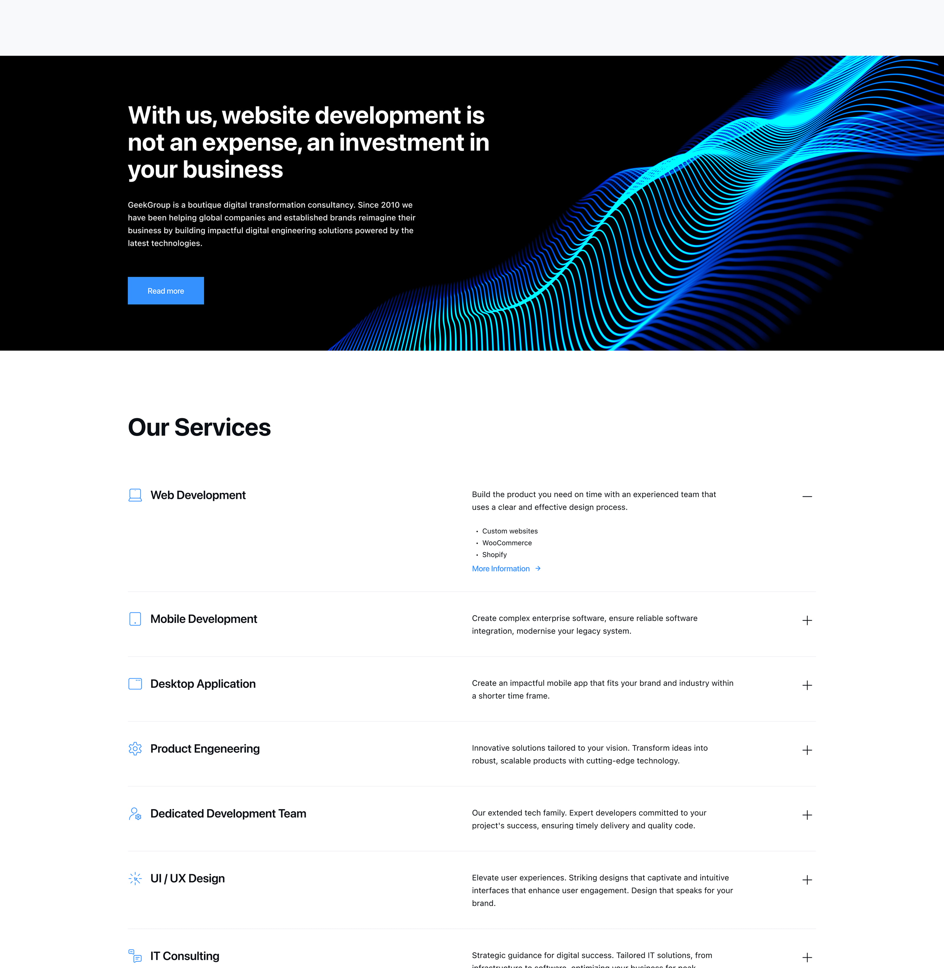
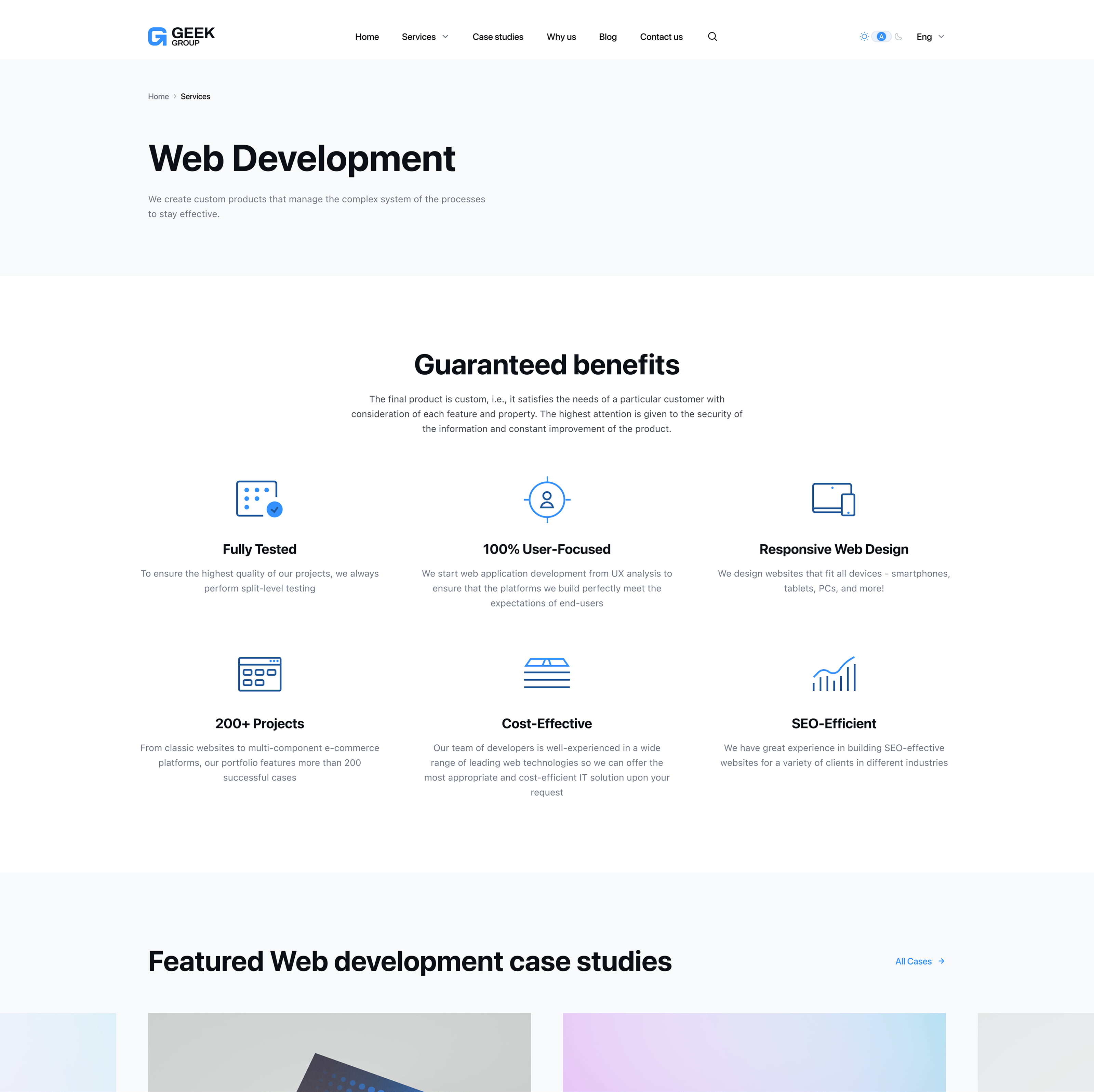
Service Page
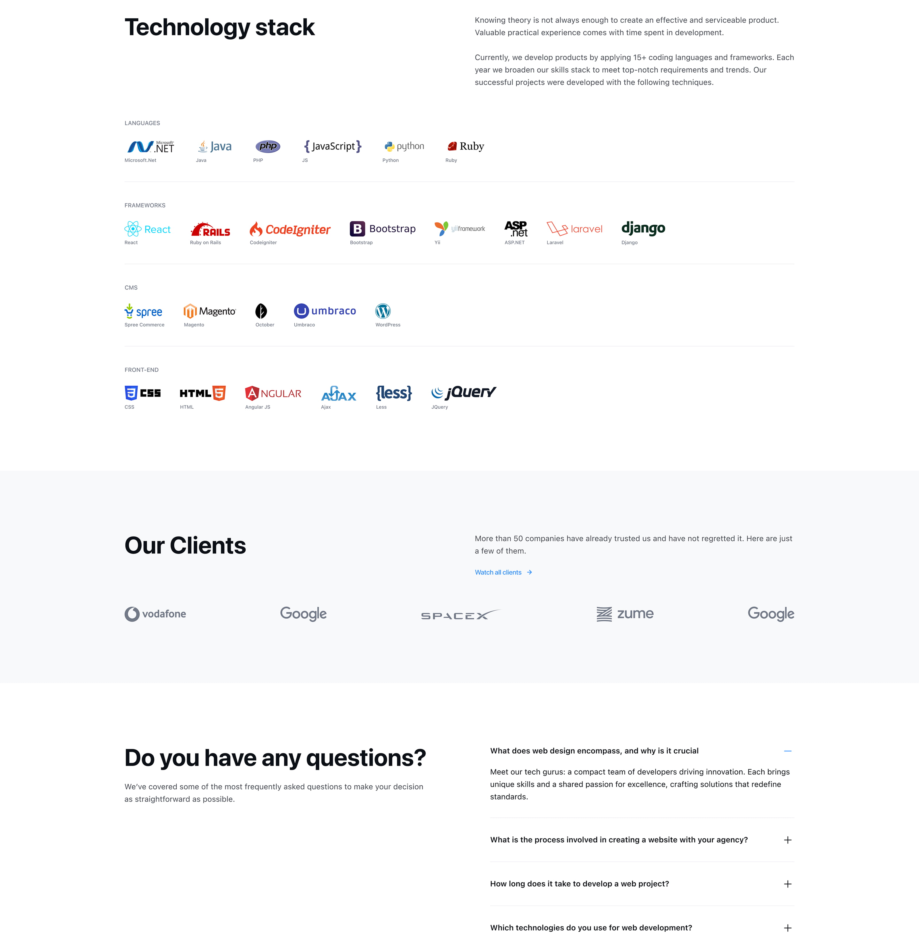
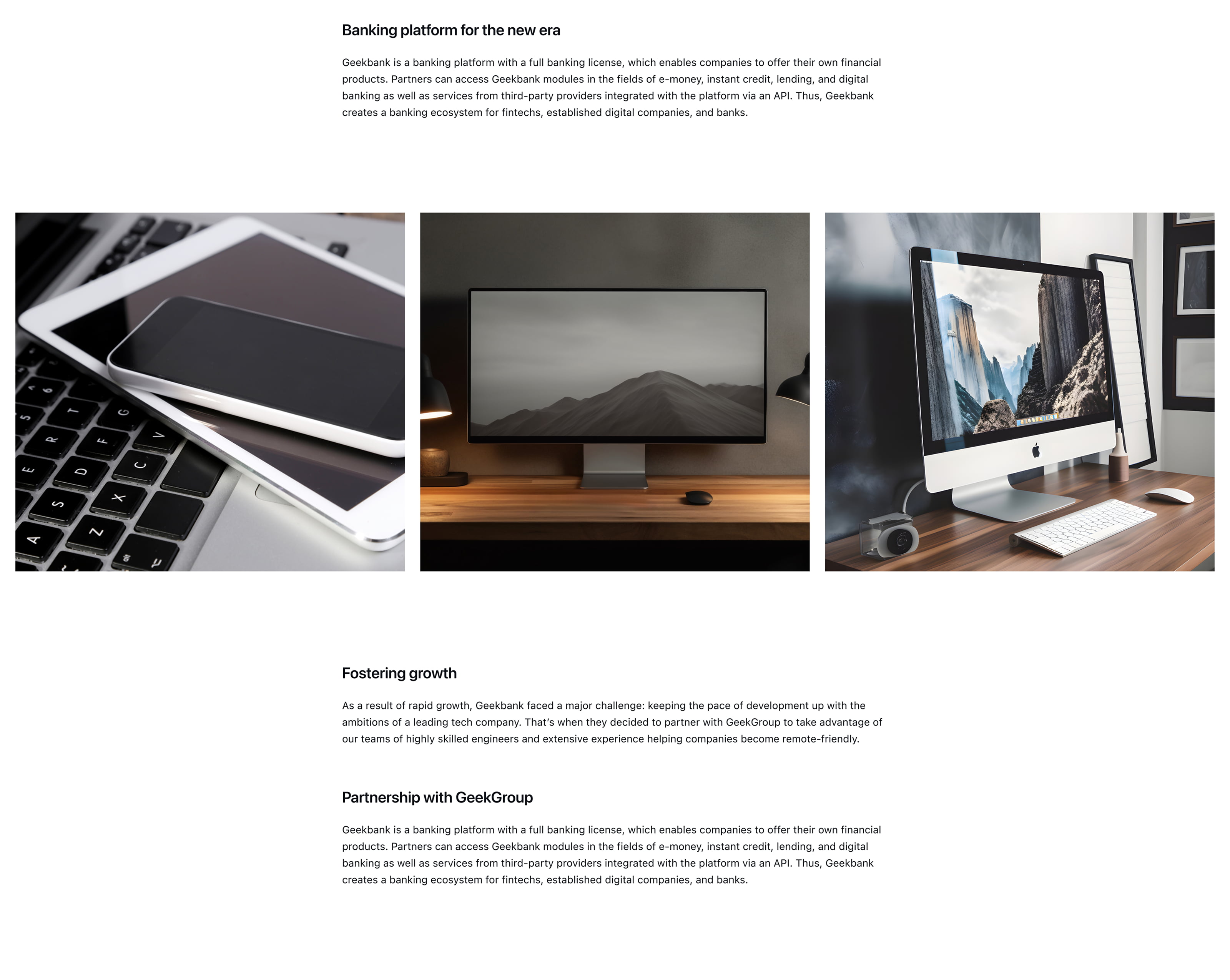
Service pages present the company's offerings in detail — a content-heavy format that needed clear scanning patterns. Consistent section structure, defined content blocks, and aligned call-to-action placement brought coherence to pages that previously each followed their own visual logic.
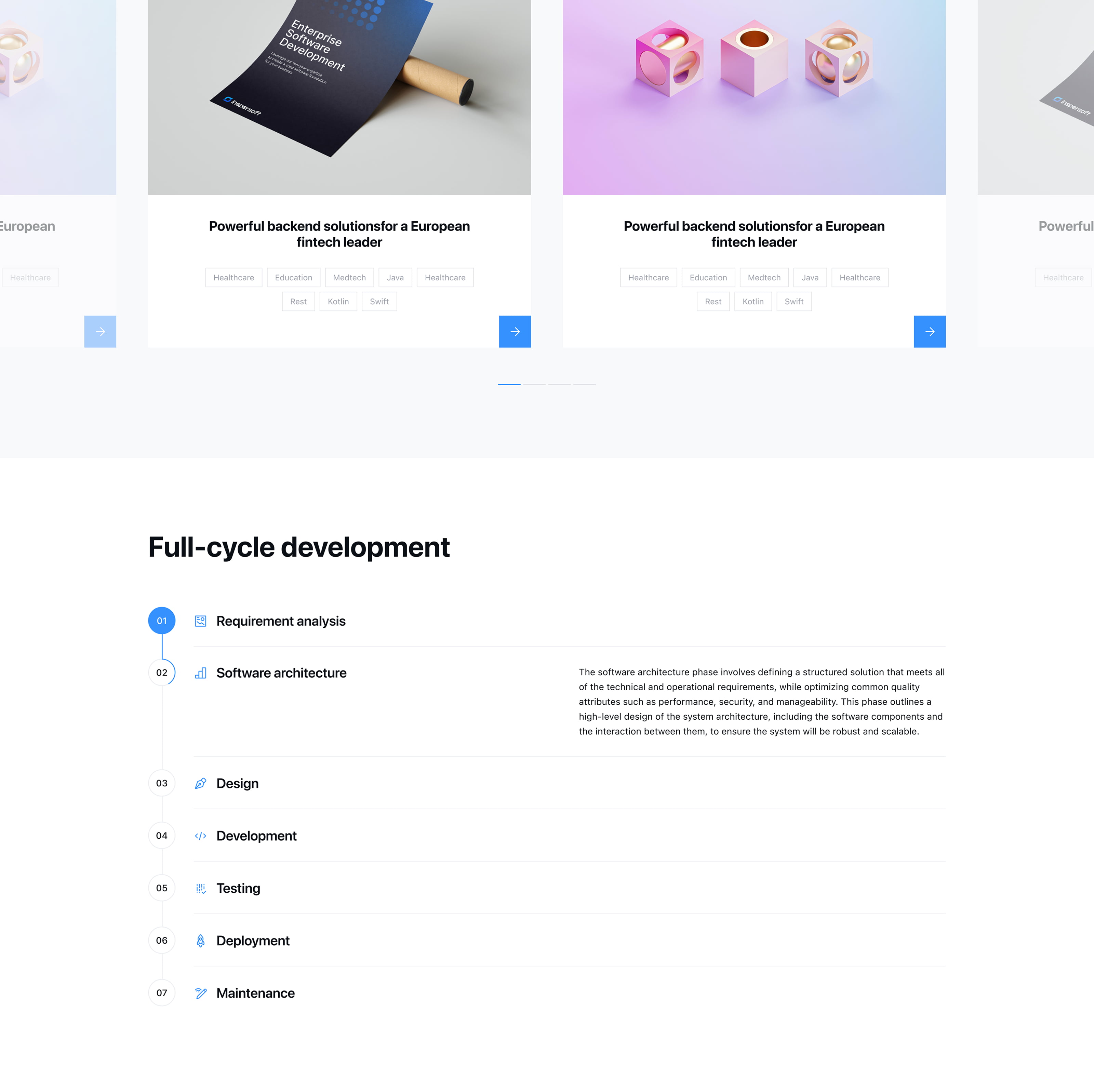
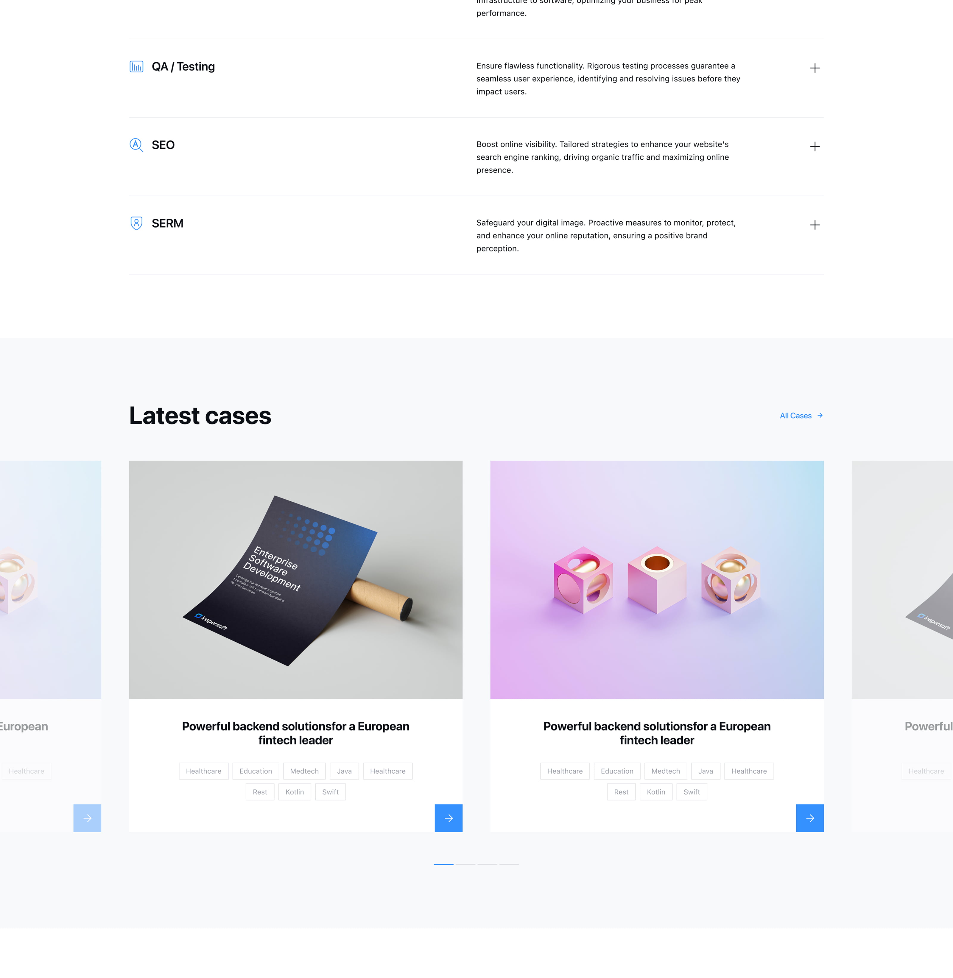
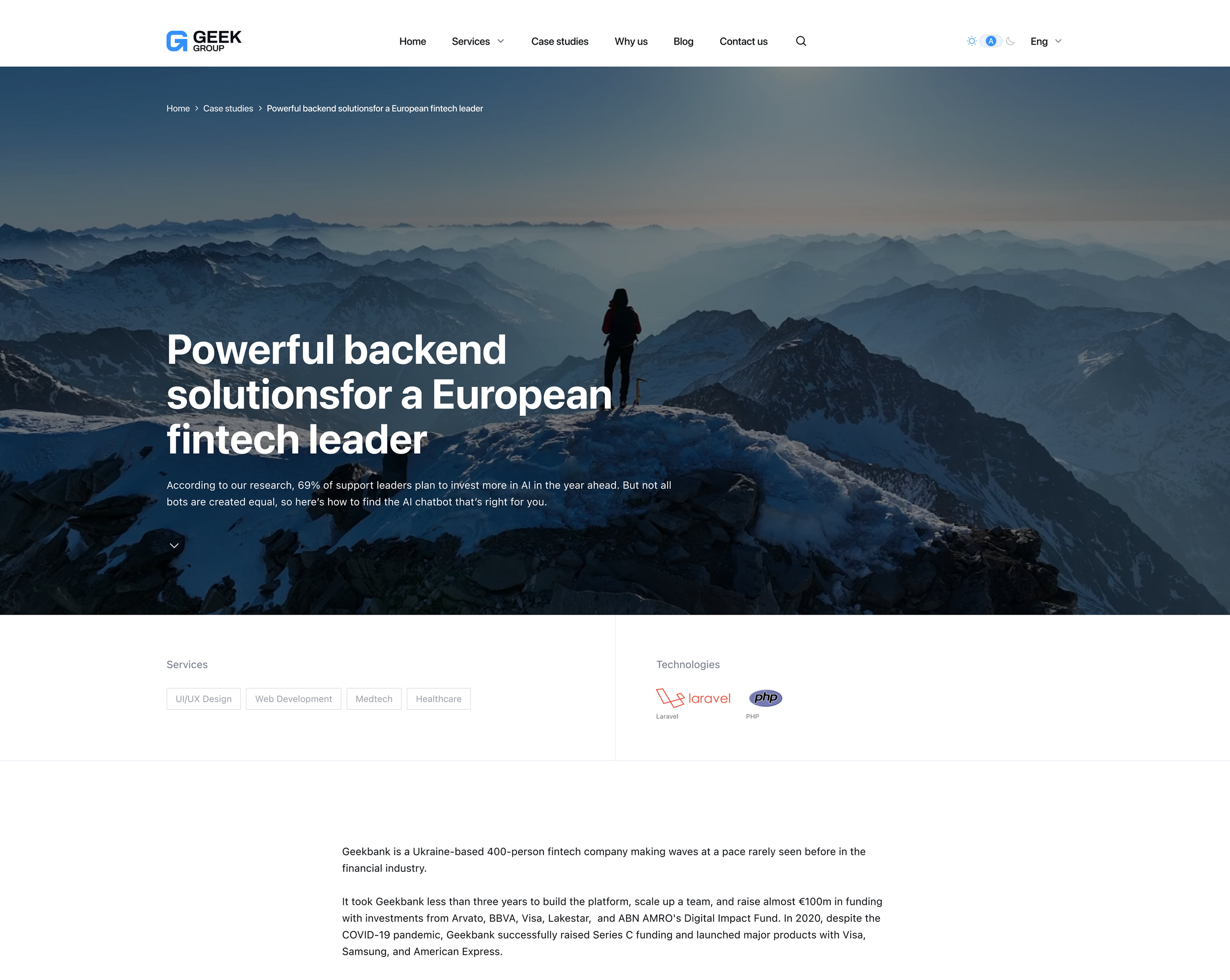
Case Page
Portfolio case pages serve as proof of capability — they need to communicate quality before a visitor reads a single word. A consistent grid for project previews, clear hierarchy between case meta and body content, and unified image treatment across the listing and detail views made the work feel curated rather than collected.
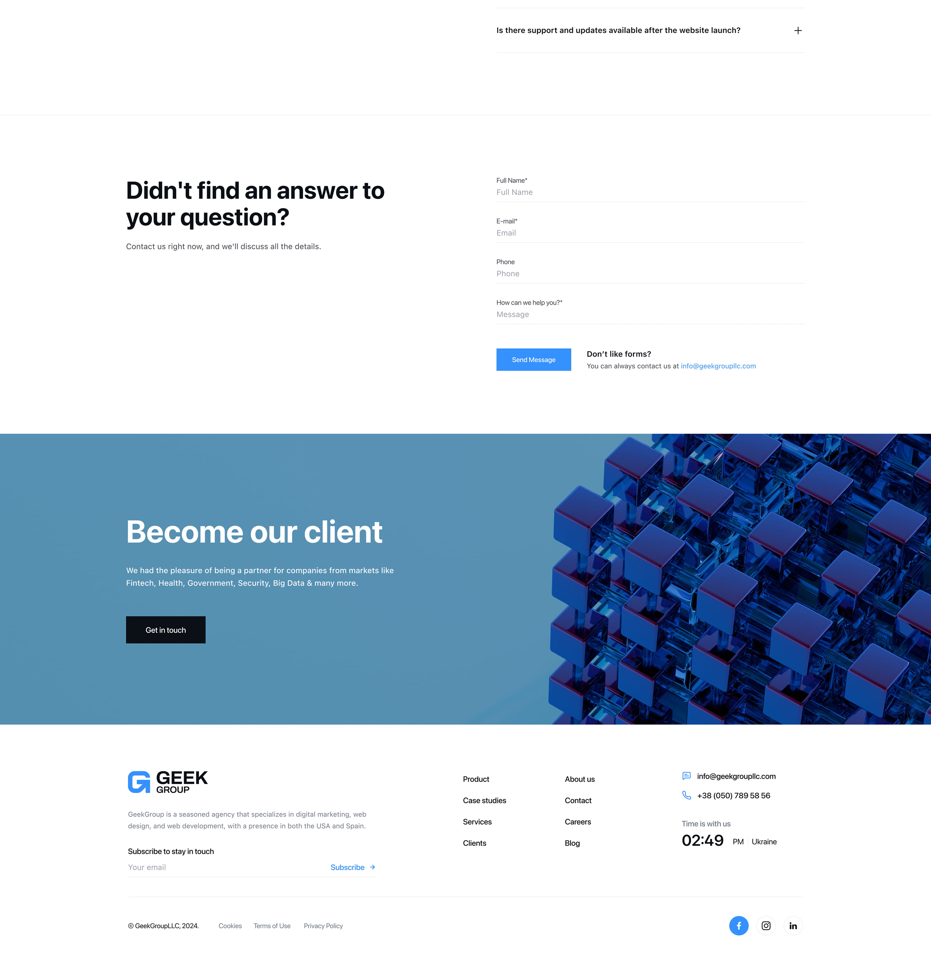
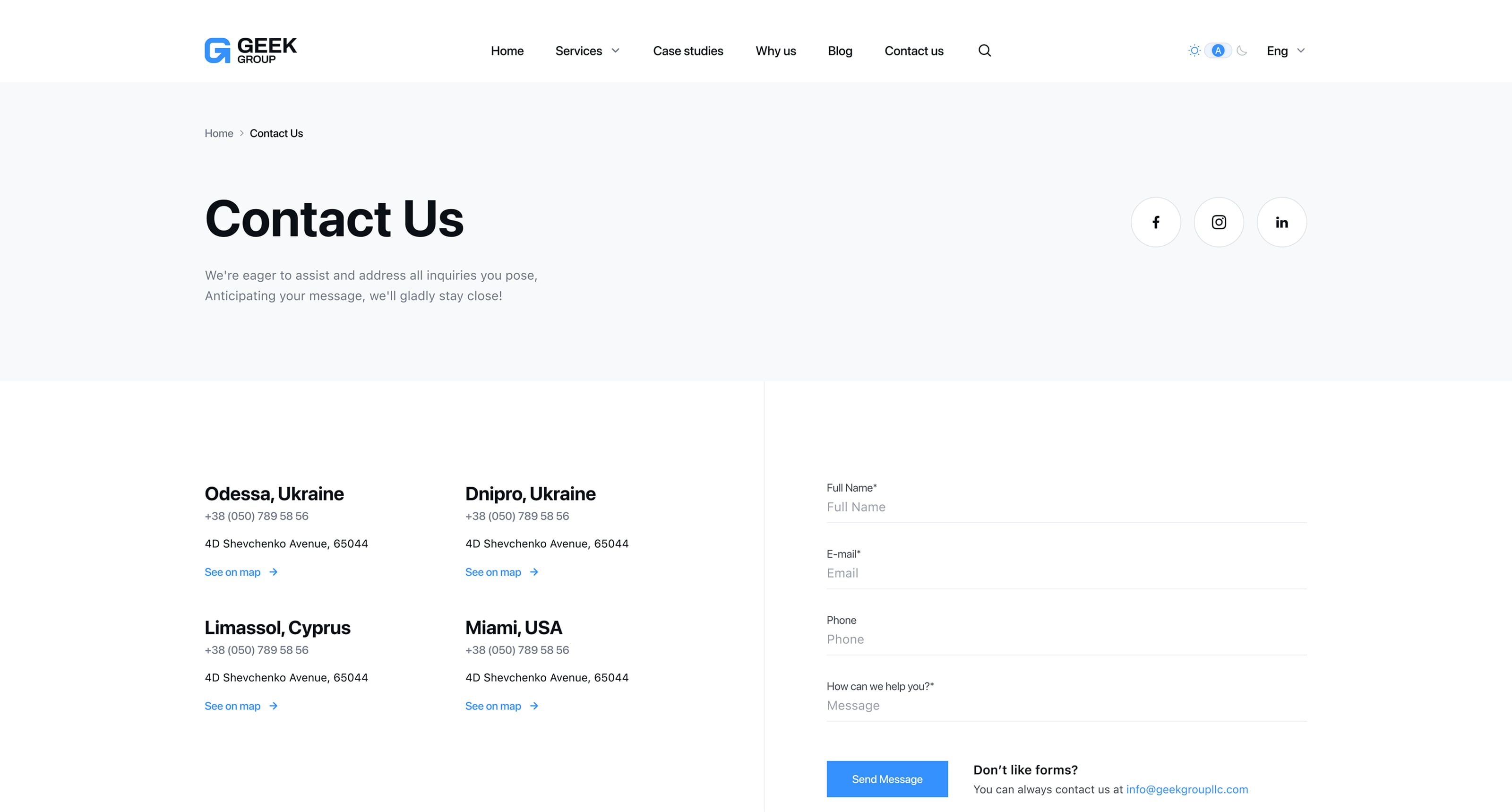
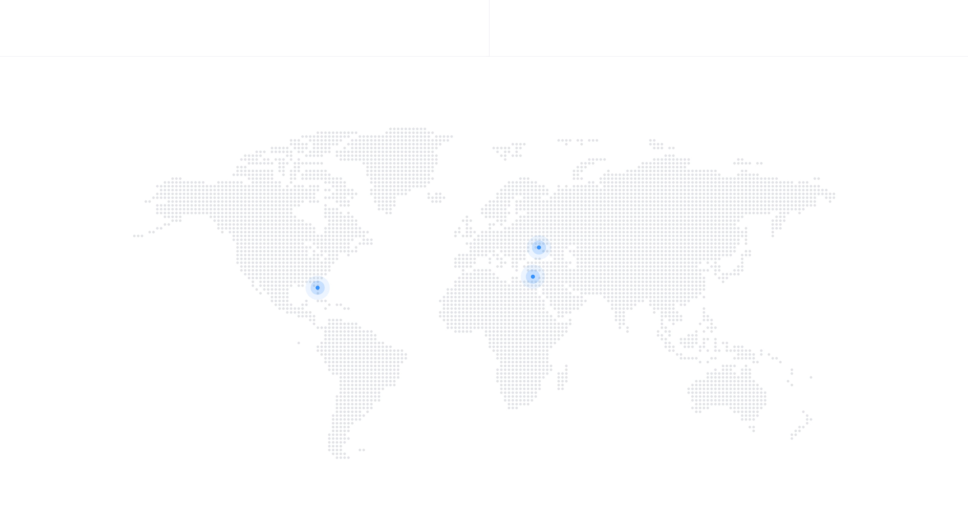
Contact Page
A contact page that needed to work in both themes without visual compromise. Form elements, label states, and layout proportions were all defined within the variable system — ensuring the page held up in light and dark without any separate styling pass.
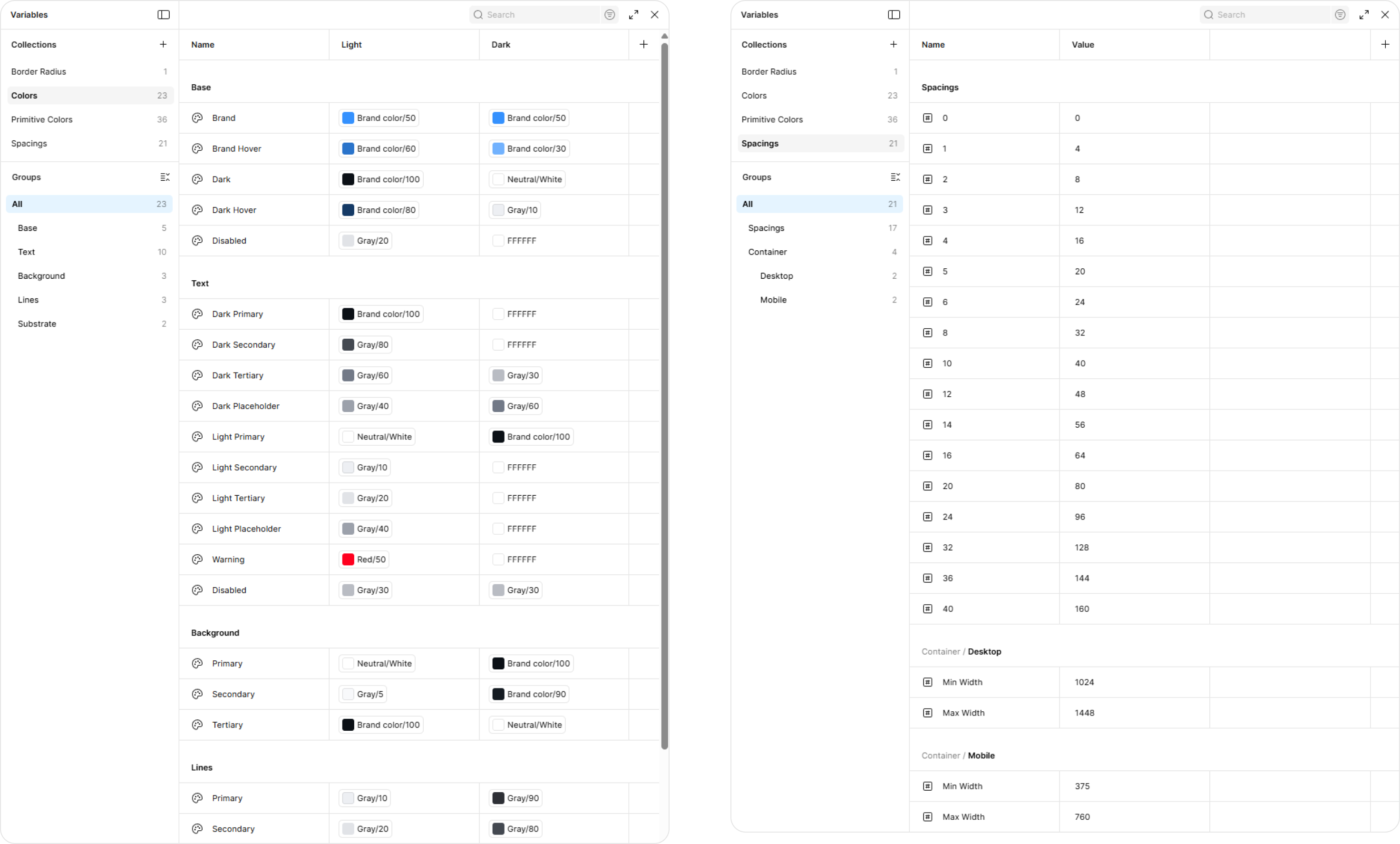
Figma File Structure
The Figma file was organized to support the variable-based system: a clear token layer, component library structured by page and state, and a consistent naming convention that made the light-to-dark switch predictable and the mobile breakpoints easy to navigate and hand off.
A website that previously read as a collection of unrelated pages now holds together as a coherent product. The variable-based system handles light, dark, and mobile from a single source of truth — no duplicate components, no manual overrides, no special-casing per page. The design file is structured for handoff and extensible without unraveling the system.
The goal wasn't a redesign. It was a system — one that made consistency the default, not something to manually maintain.