HealthStar
UI refresh for a medical events platform. Turning a developer-driven Bootstrap interface into a coherent, implementation-friendly design system.
HealthStar operates a large event-management platform for the life sciences industry, with different portals for different roles and dedicated modules for speaker selection and milestone tracking. For years, the product had been evolving through developer-driven changes based on client requests — Bootstrap pieces and ad-hoc UI decisions layered on top of each other.
I joined the project at the request of the development team to systematically improve the UI without breaking the familiar structure for existing clients.
Modernise the visual layer of HealthStar's multi-portal events platform without disrupting existing workflows. Unify a fragmented, developer-built UI into a coherent, consistent interface. Improve the readability of dense, data-heavy screens — tables, forms, dashboards.
Introduce small UX tweaks where they clearly made frequent actions faster, and deliver a reusable Figma-based UI kit the development team could implement and extend on their own.
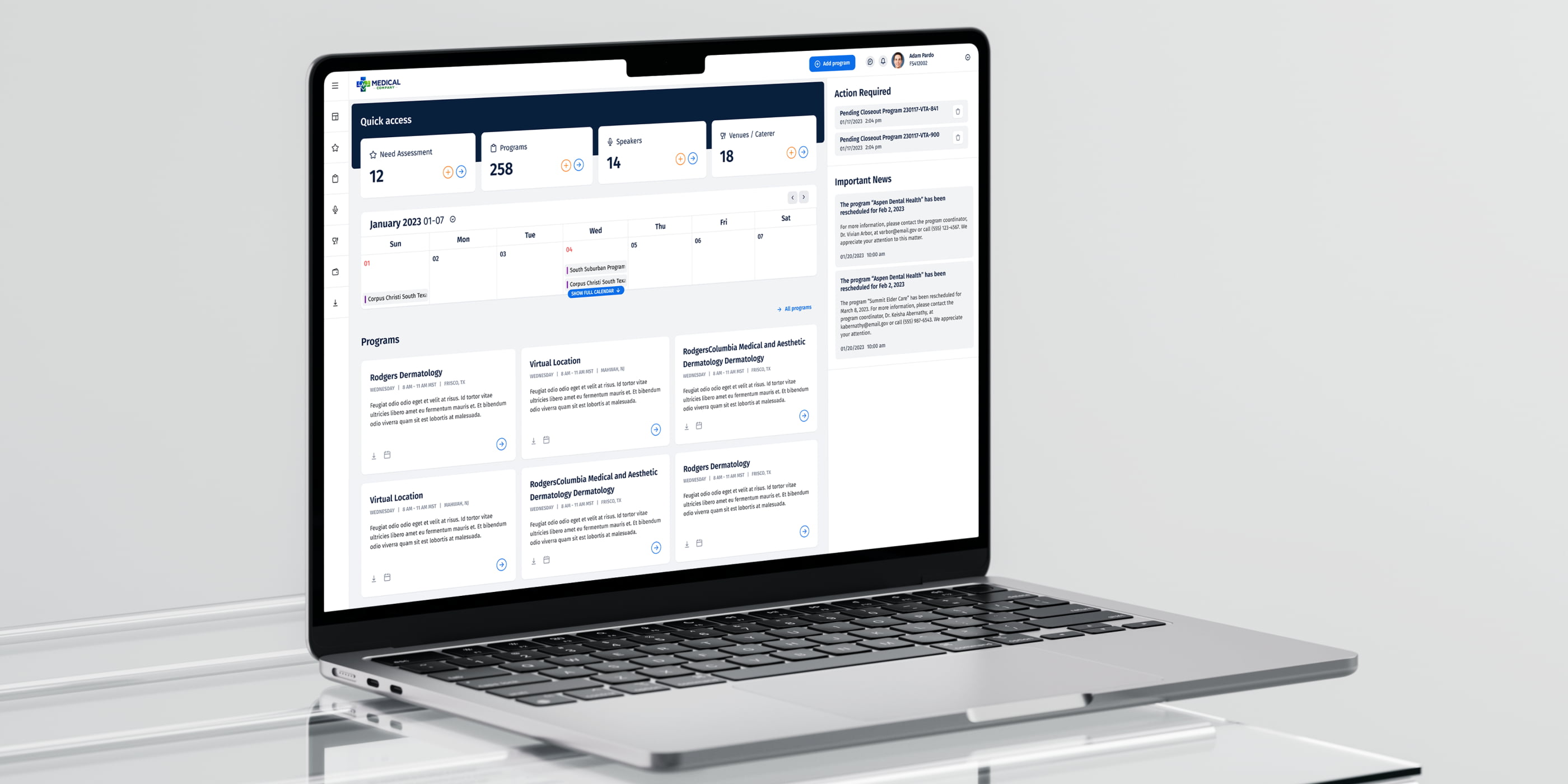
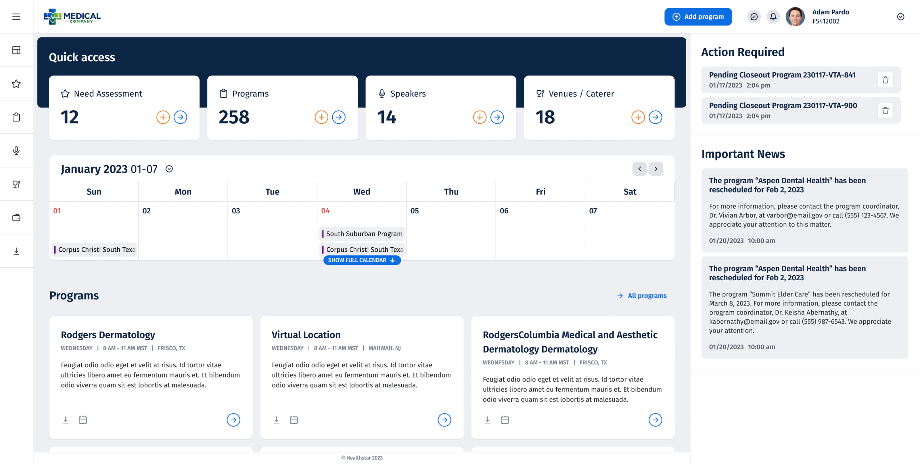
Dashboard
The central hub for event managers — heavy with data: status indicators, event timelines, and action triggers spread across a dense grid. The redesign introduced visual hierarchy to the noise: consistent card layouts, a cleaner typographic scale, and clearer state indicators to reduce scanning time.
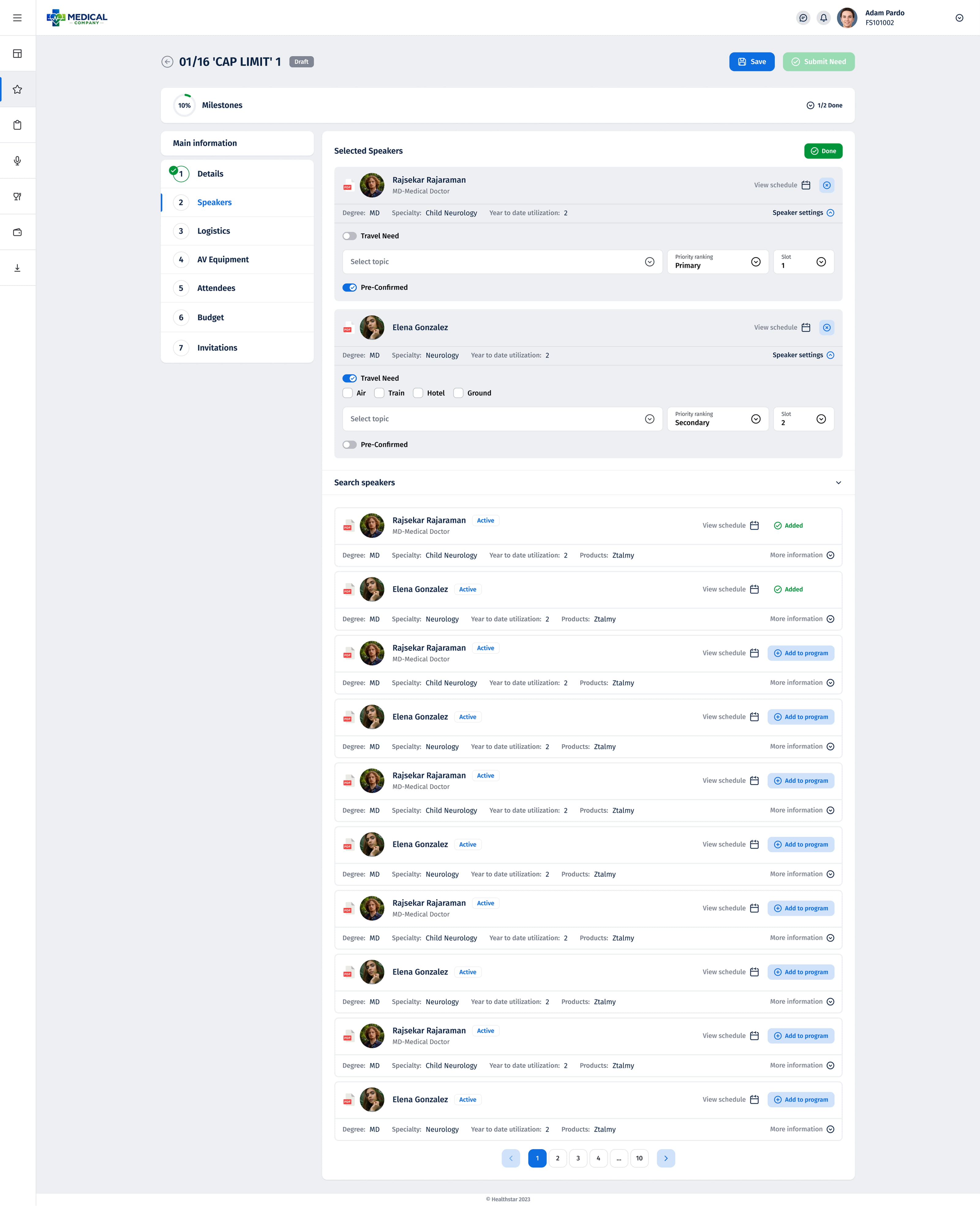
Milestones — Speaker Management
The speaker selection module required managing large lists through multi-step workflows. Two key states — adding a speaker and reviewing the confirmed list — had to feel like a single coherent flow. Consistent table patterns, clear action controls, and visible status feedback tied them together into one navigable experience.
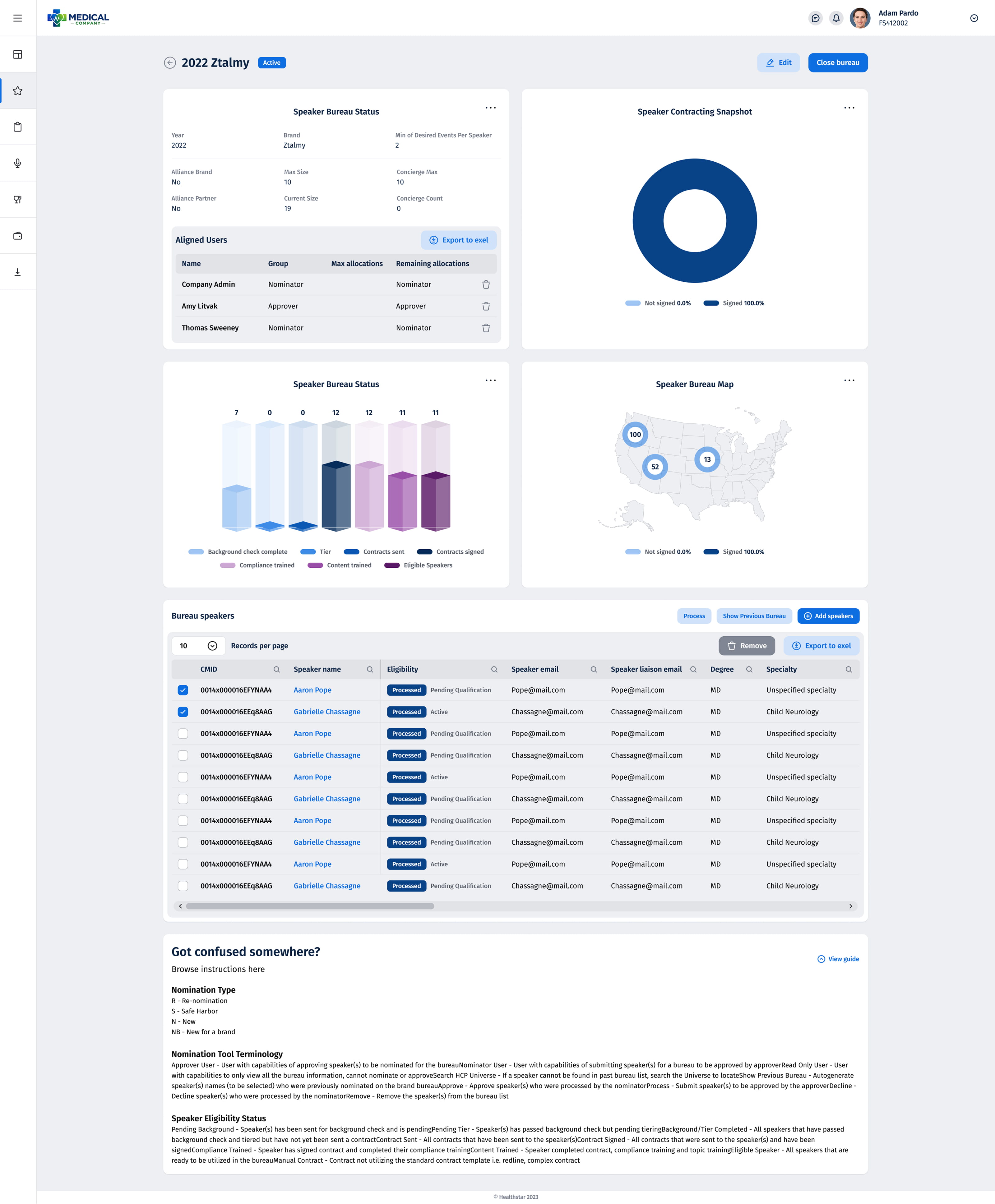
Bureau Page with Statistics
A reporting view used by bureau managers to track speaker performance and budget allocation across events. Dense with numbers, filters, and exportable data. The redesign focused on scanability — grouping related stats, improving the filter bar, and applying a consistent data-table structure that matched the rest of the platform.
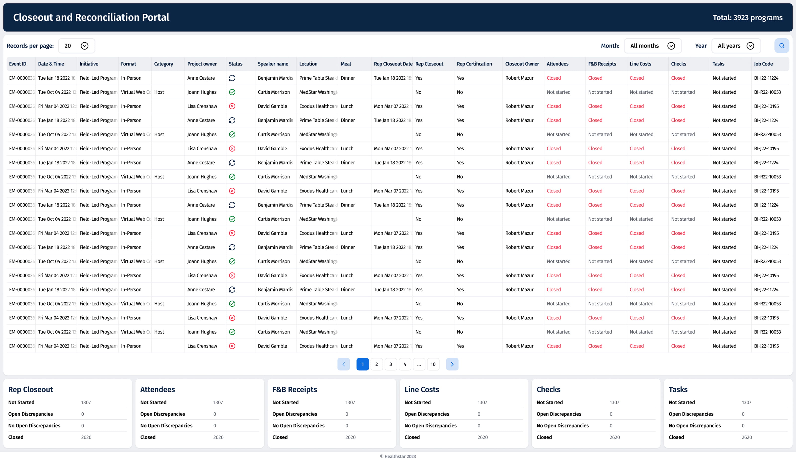
Closeout Portal
Used at the end of each event lifecycle to collect and verify final data. A multi-step form with validation states and conditional fields. The redesign structured the flow into clearly separated sections with visible progress indicators, reducing input errors and the time spent reaching completion.
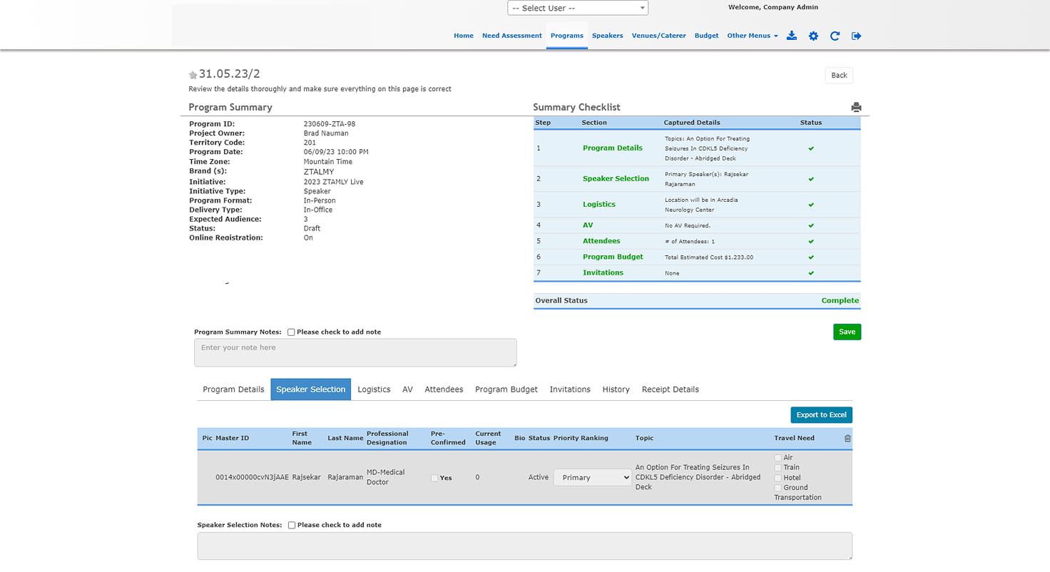
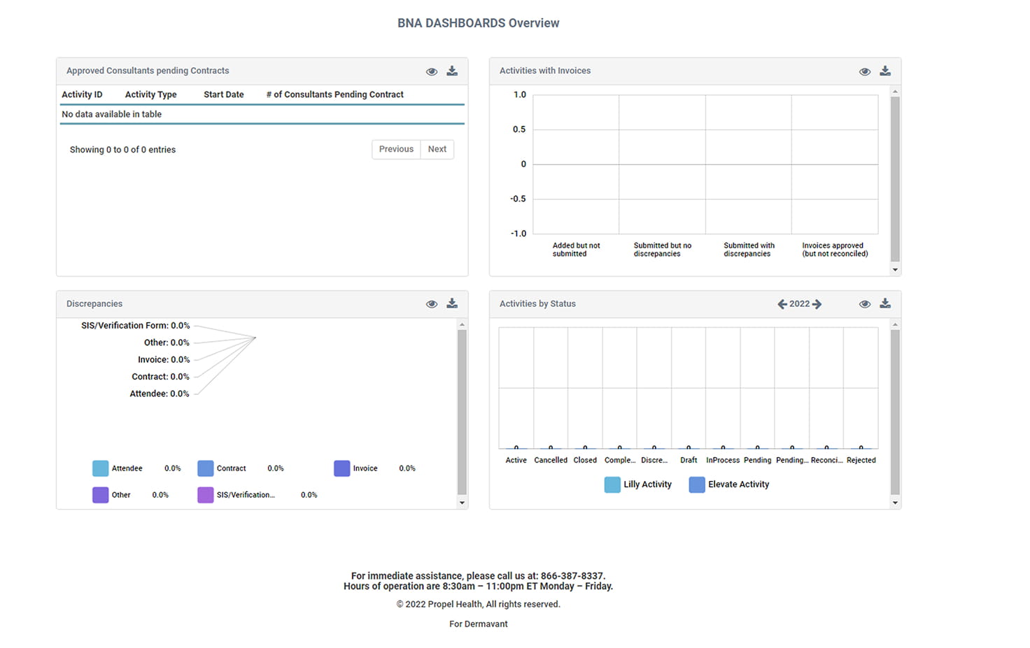
The original developer-driven interface — inconsistent spacing, mixed Bootstrap components, no shared visual language. These screens show the baseline the redesign was working against, where each section had grown independently without a unifying system behind it.
A platform with years of accumulated ad-hoc decisions, refactored into a coherent visual system — without breaking a single existing workflow. The result was a reusable Figma UI kit the development team could extend independently, applied across dashboards, tables, forms, and multi-step flows.
The constraint was not to redesign — it was to unify. Every decision had to feel like it had always belonged.