EatBeat
A mobile app for mindful nutrition. Onboarding and paywall redesign: reducing drop-off, simplifying the flow, and increasing conversion.
EatBeat is a mobile app for iOS and Android that helps users eat a balanced diet without strict restrictions. The product is built on the Nordic Nutrition Recommendations and uses AI to analyze meals via photo or barcode scanner.
The core mechanic is a personal Health Score that turns daily nutrition into a clear, actionable goal. I joined the project after the previous designer.
Full onboarding redesign, split into 3 modules: the Welcome module (app overview), the Introductory module (goals and physical parameters), and the Paywall. Reduce drop-off at each stage and increase conversion to the main app.
- Analysed each module through competitive audit, funnel data, and current-state review.
- Formed hypotheses, designed, and iterated in short cycles with the team.
- Applied UX principles: Hick's Law, cognitive load, progressive disclosure.
- Evaluated results and refined through post-release iterations.
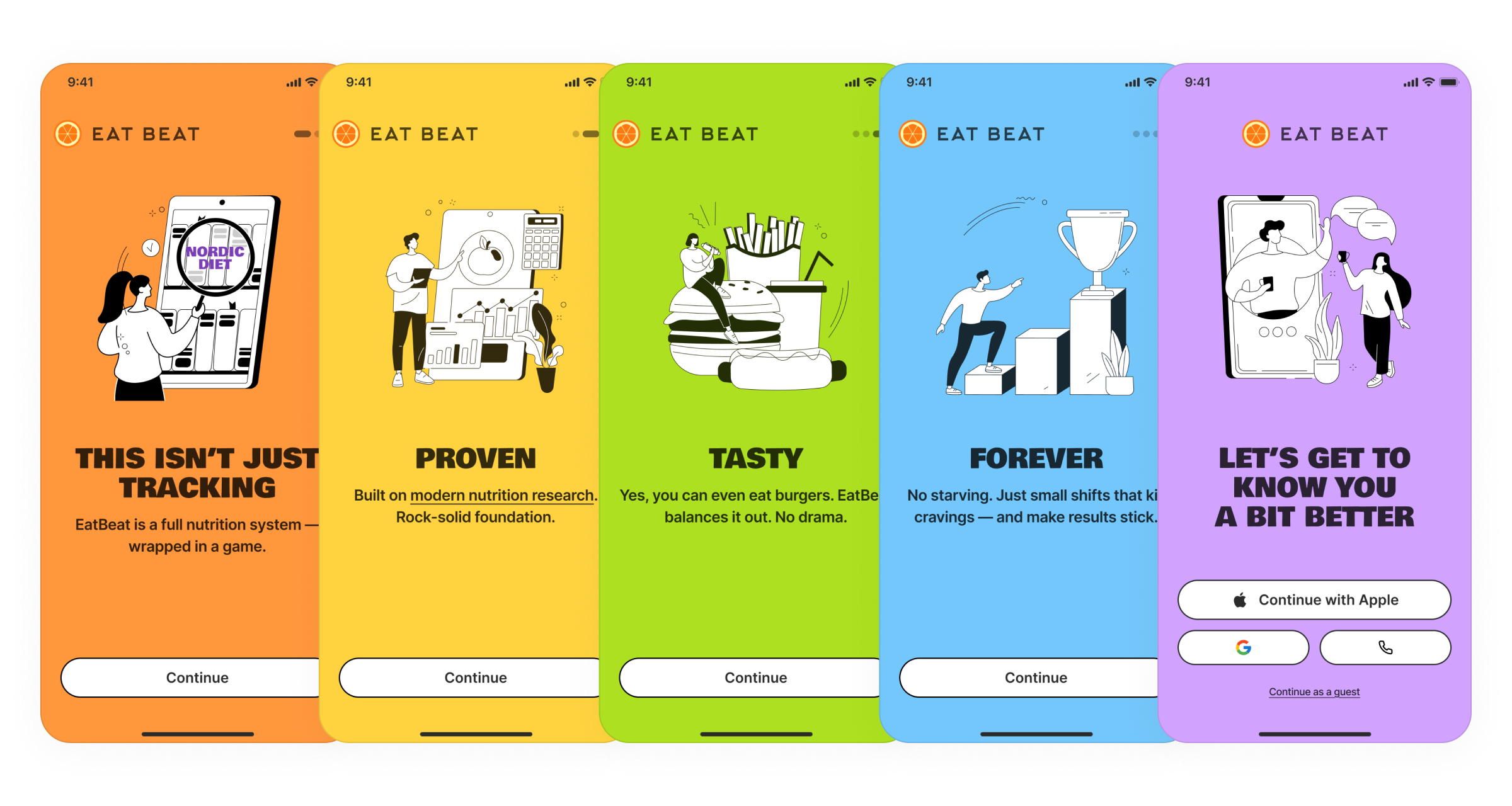
Welcome Onboarding
Around 30% of new users were leaving the app on the very first screens.
Reduced the onboarding to 5 screens. Replaced overloaded slides with monochrome illustrations on solid color backgrounds. Rewrote the copy together with the UX Writer: the core message in a large, high-contrast headline, supporting detail in the description. The final screen was redesigned to feel like a natural end to the welcome flow with a clear call to action. Added swipe navigation between onboarding screens.
After several iterations, new user retention at this stage exceeded 80%.
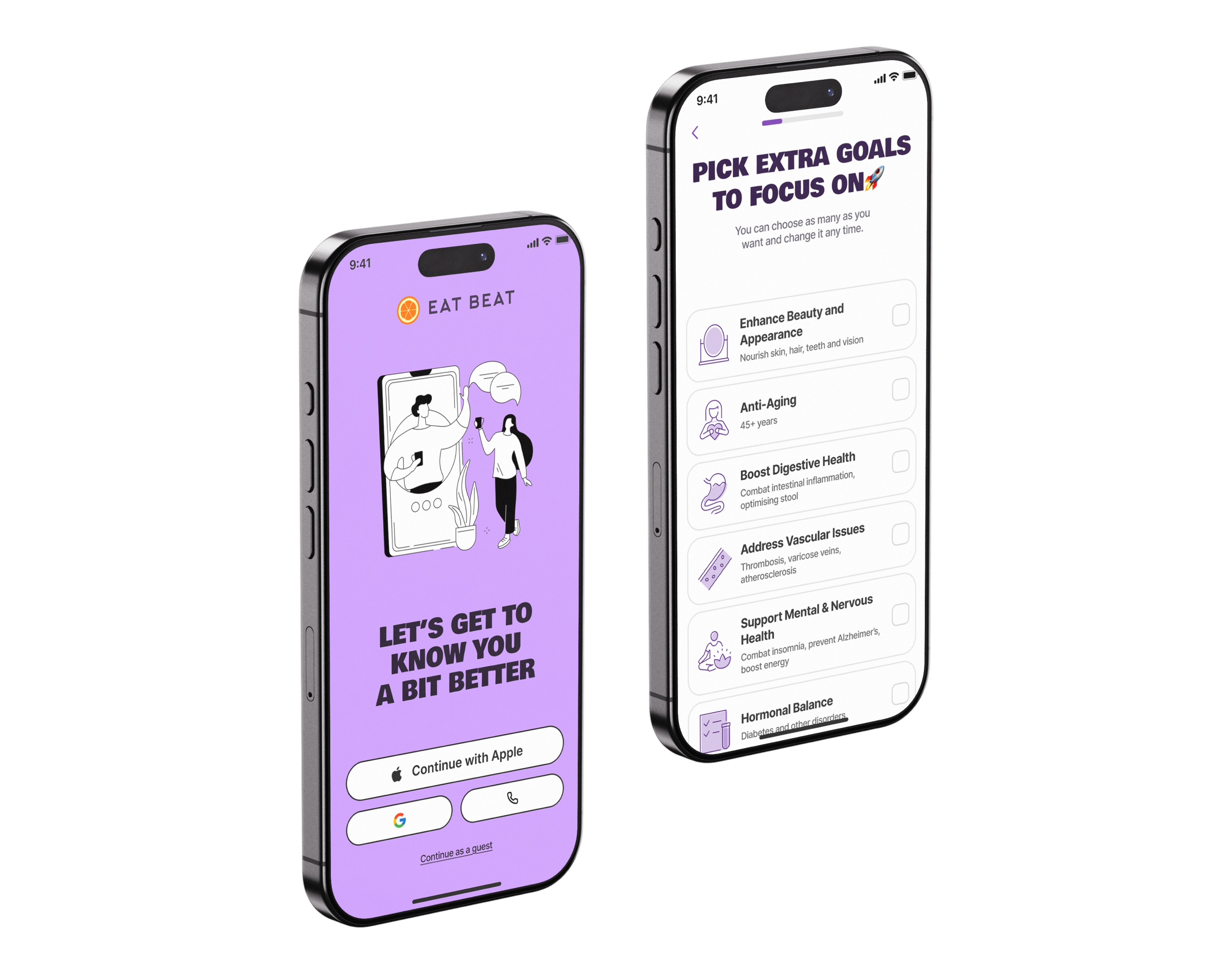
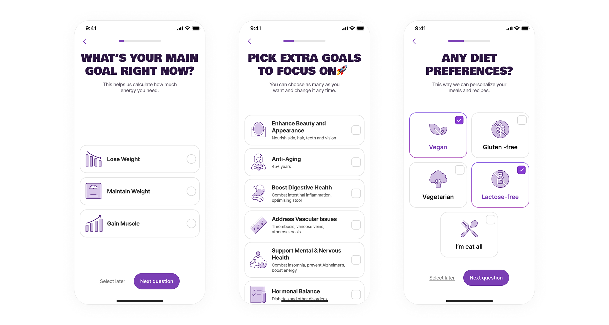
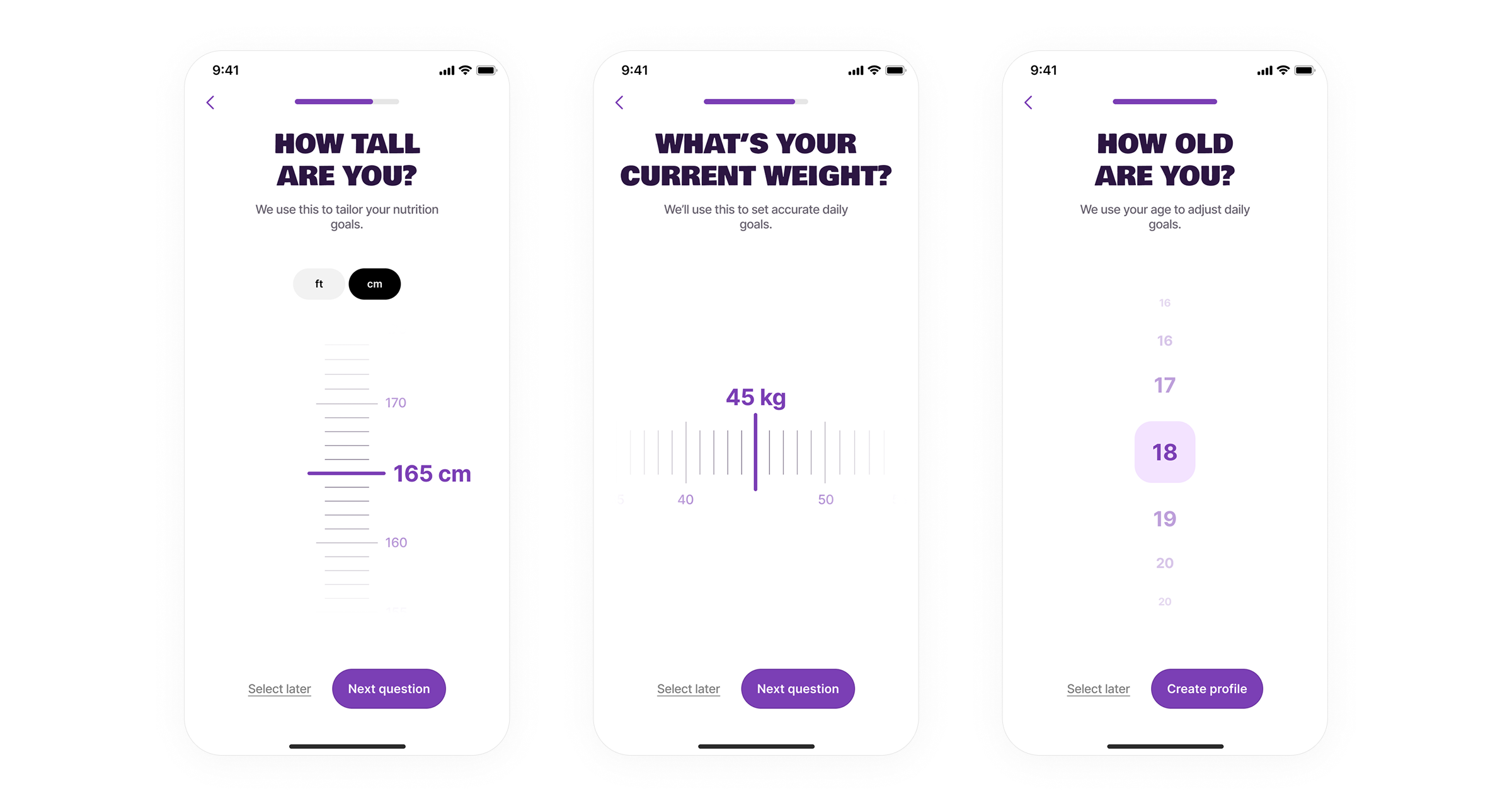
Introductory Onboarding
High drop-off on the data collection screen: seven fields on a single screen, some of which required manual keyboard input.
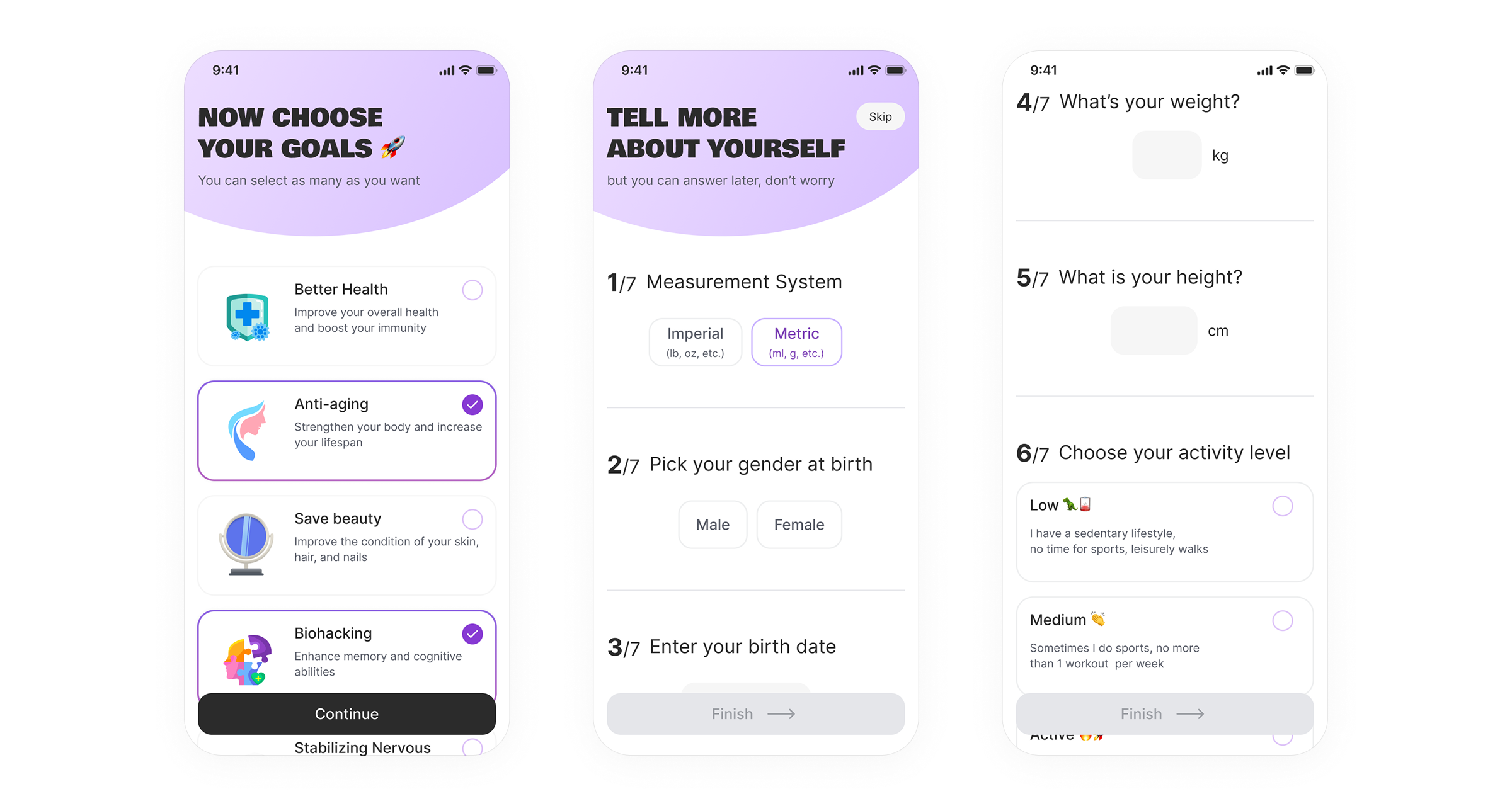
Split the introductory onboarding into separate steps with a progress indicator. Replaced manual text input with an interactive scroll for height and weight, and an age selector instead of a date-of-birth field. For units, instead of choosing between metric and imperial, I gave users a direct choice of ft or cm: some users simply do not know the terminology. The app remembers the selection and carries it forward to the next step. Reframed all headings as questions with a short explanation of why each piece of information is needed and a note that it can be changed in settings.
Time spent on this part of the onboarding decreased. Data accuracy improved: users stopped making random selections just to skip screens. Over 70% of users now complete this module.
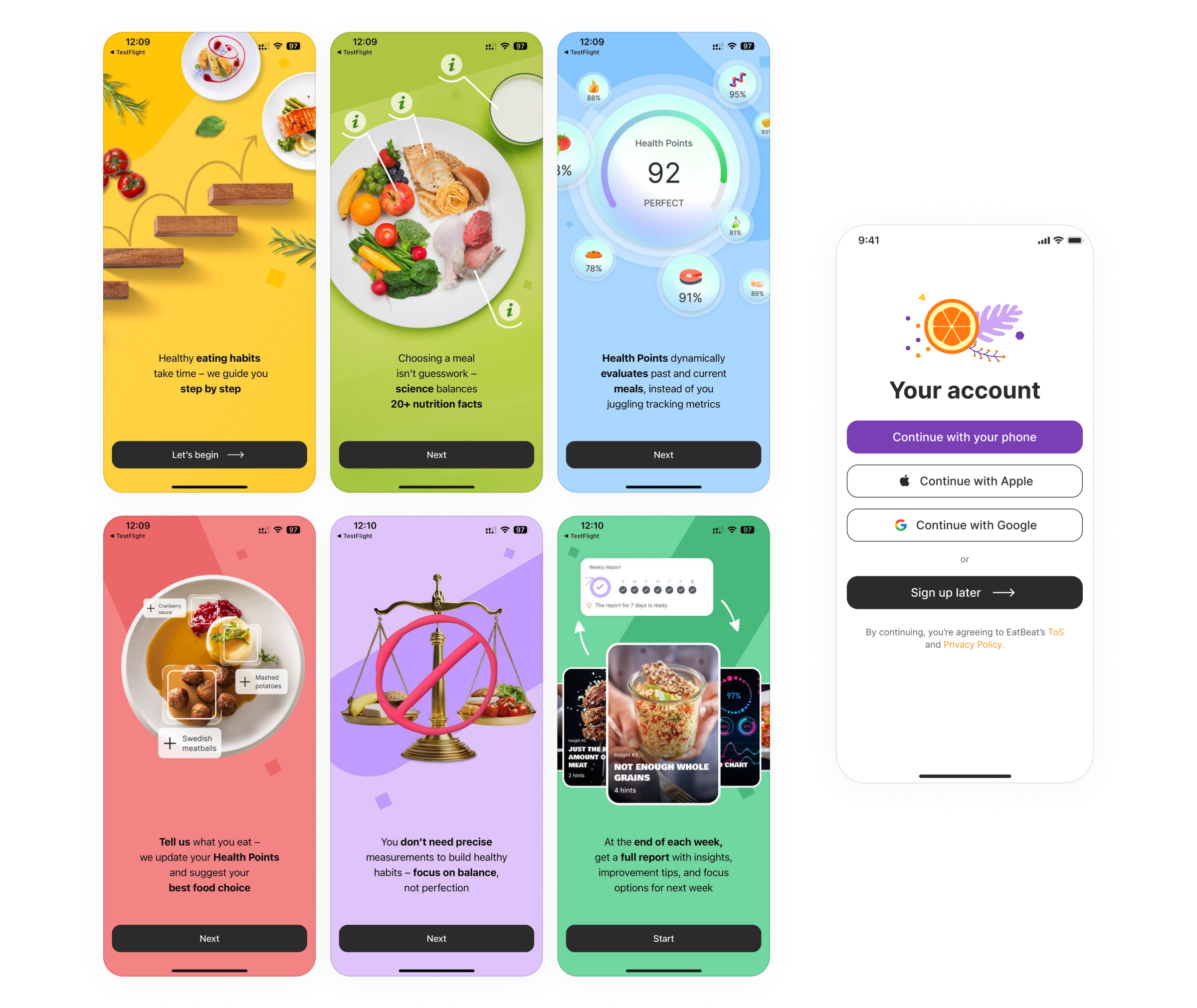
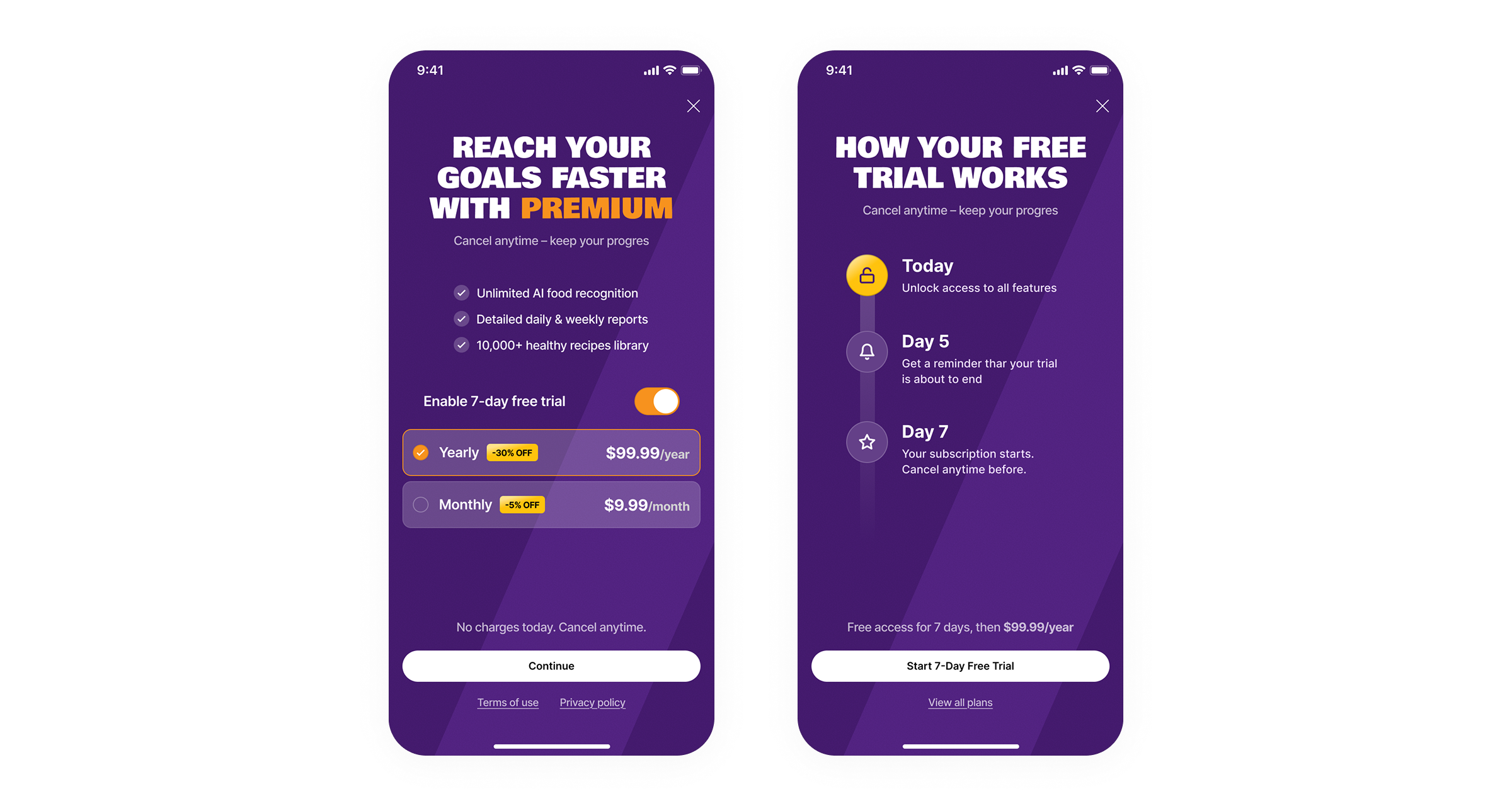
Paywall
The highest drop-off point in the entire flow. Users did not understand what they were getting or what they were agreeing to.
I reviewed the screen and compared it against competitors that have been on the market for years. Three problems emerged: information overload with no clear benefit, weak copy, and a confusing plan selection structure. The mandatory 7-day trial was perceived as a condition rather than a perk. Users were afraid of this screen.
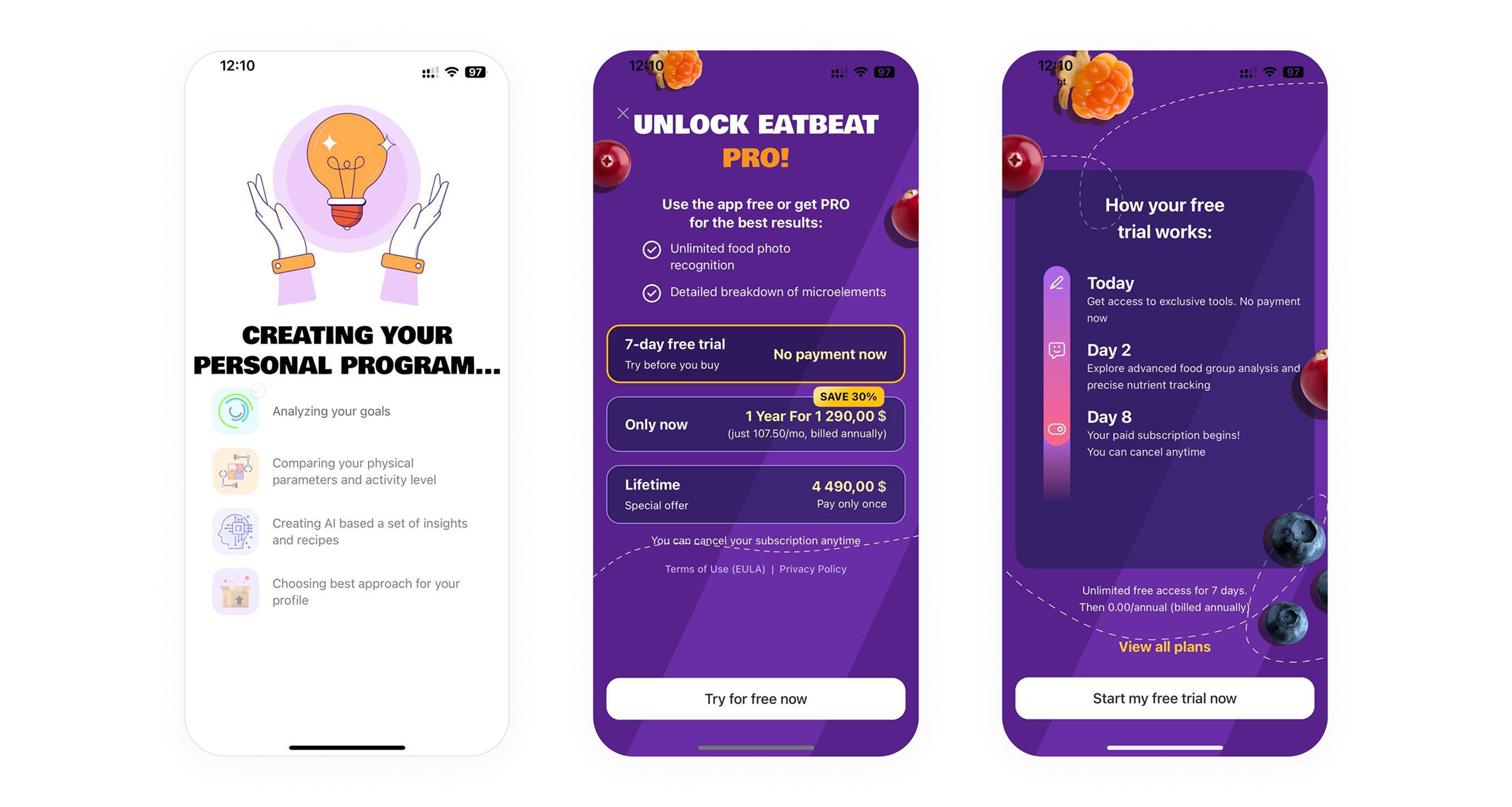
Rewrote the headline as a call to action that immediately communicates the value of subscribing. Copy became more transparent: clear benefits and straightforward terms. Instead of a forced 7-day trial, users can now choose the plan that suits them directly, with the trial period turned into a separate toggle they can switch on or off themselves.
Users became more confident on this screen and more willing to proceed, whether with a subscription or without. The rate of progression to the main app increased by 60%.
Three modules, three different types of problems. In each case the solution came from reducing cognitive load: fewer choices, clearer copy, simpler structure. Not a redesign for its own sake, but targeted work on the points where drop-off was highest.
The most effective change across all three modules was not adding new elements, but removing unnecessary ones.